
Illustration by Thomas Kim
Challenges & background
Io-Tahoe is big data discovery tool for data engineers and data stewards. Product team kept adding new features for a couple of years without holistic approaches to the product, so the user experience of the product was inconsistent and problematic for users. As a part of redesign, we decided to build UI component libraries first for upcoming new features and enhancing existing product.
Tools: Sketch, Anima, Zeplin, Marvel
Collaborator: Petr Vlk
Colors
There was a branding guideline defined by Io-Tahoe and there was no flexibility to change the brand design at that moment. So skipping branding design process and decided to use 2 major colors from the brand guideline for main interactions.
References; https://color.adobe.com/create https://coolors.co/ https://material.io/design/color/
References; https://color.adobe.com/create https://coolors.co/ https://material.io/design/color/

Fonts
To align with our branding, we decided keeping "Montserrat" as a primary font, but the font is not great fit for data table. Data tables requires showing the information very condensed and containing a lot of information (some variables are extremely long), so we decided to change "Roboto" only for data tables at the moment. We used https://fontawesome.com/ for list icons.
I recommend typography system should include following colors as text styles.
• Black
• White
• Grey
• Primary
• Primary
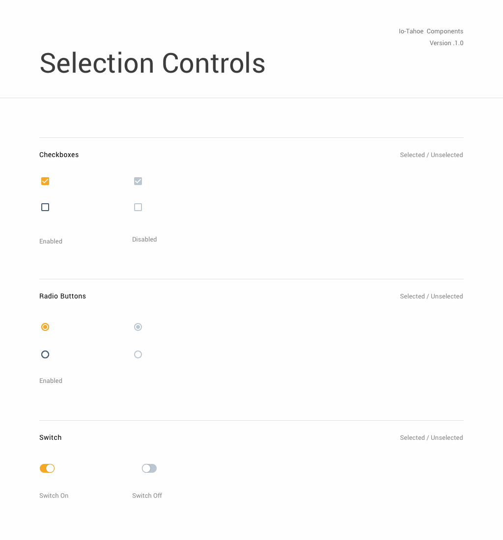
Design Components
Started with atomic design as buttons, selection control, input field and dropdown, cards, tabs, and tags. For dynamic buttons, I used anima plug-in. It works fine in the latest Sketch 55.2 and exporting to Zeplin, Marvel, and InVision. Next step was creating molecule level designs using atoms. All components are added as a Sketch library in cloud space, so all designers will use the same design and screens using the components are always up-to-date.
Naming is extremely important to organize symbols. Starts with higher hierarchies first.
[Atoms, Molecules, Organisms] / [Assets, Buttons, Contents, Inputs] / [Fills, Borders, Shadows] / [Color] / [Type] / [Status]
Naming is extremely important to organize symbols. Starts with higher hierarchies first.
[Atoms, Molecules, Organisms] / [Assets, Buttons, Contents, Inputs] / [Fills, Borders, Shadows] / [Color] / [Type] / [Status]


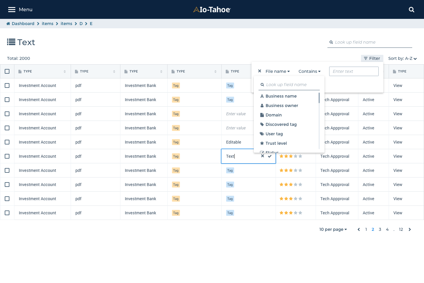
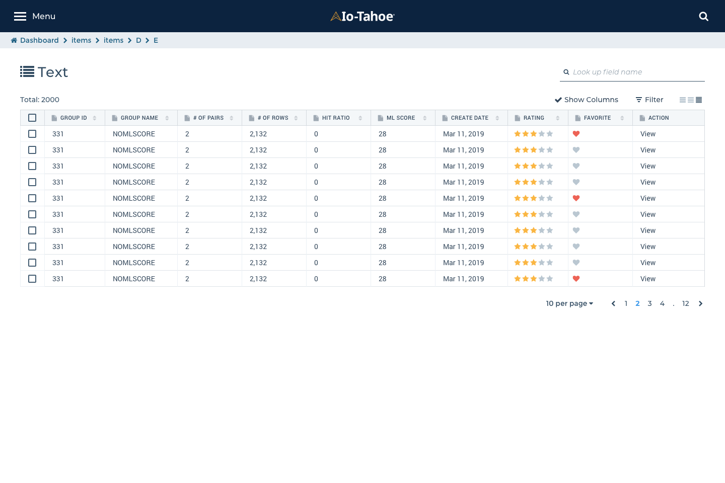
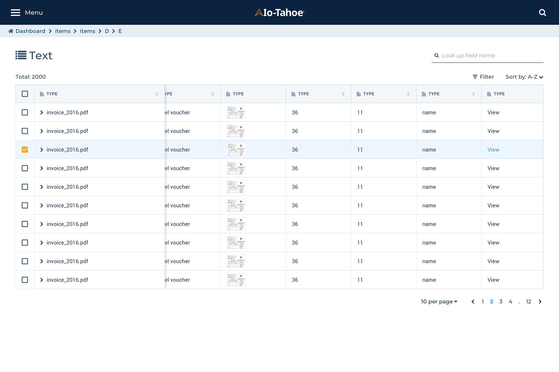
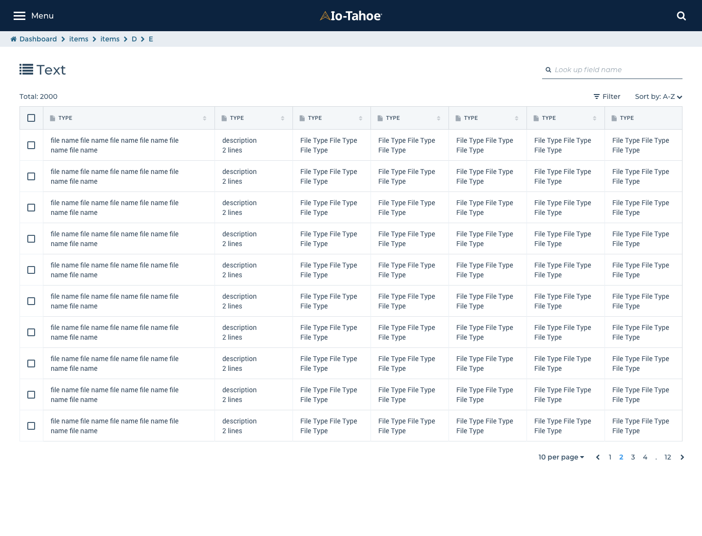
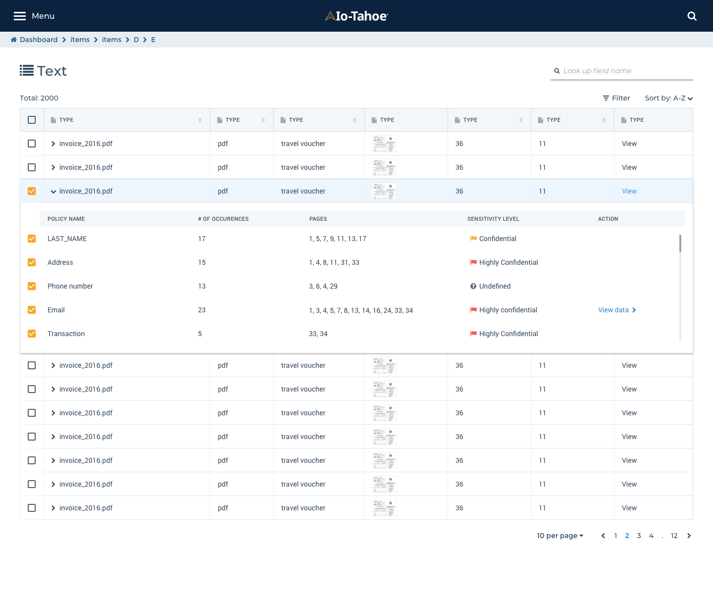
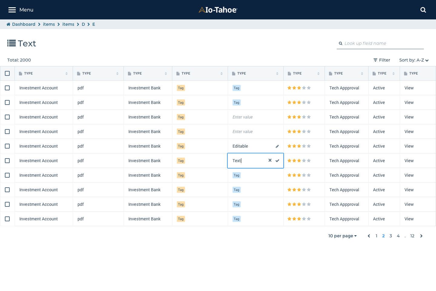
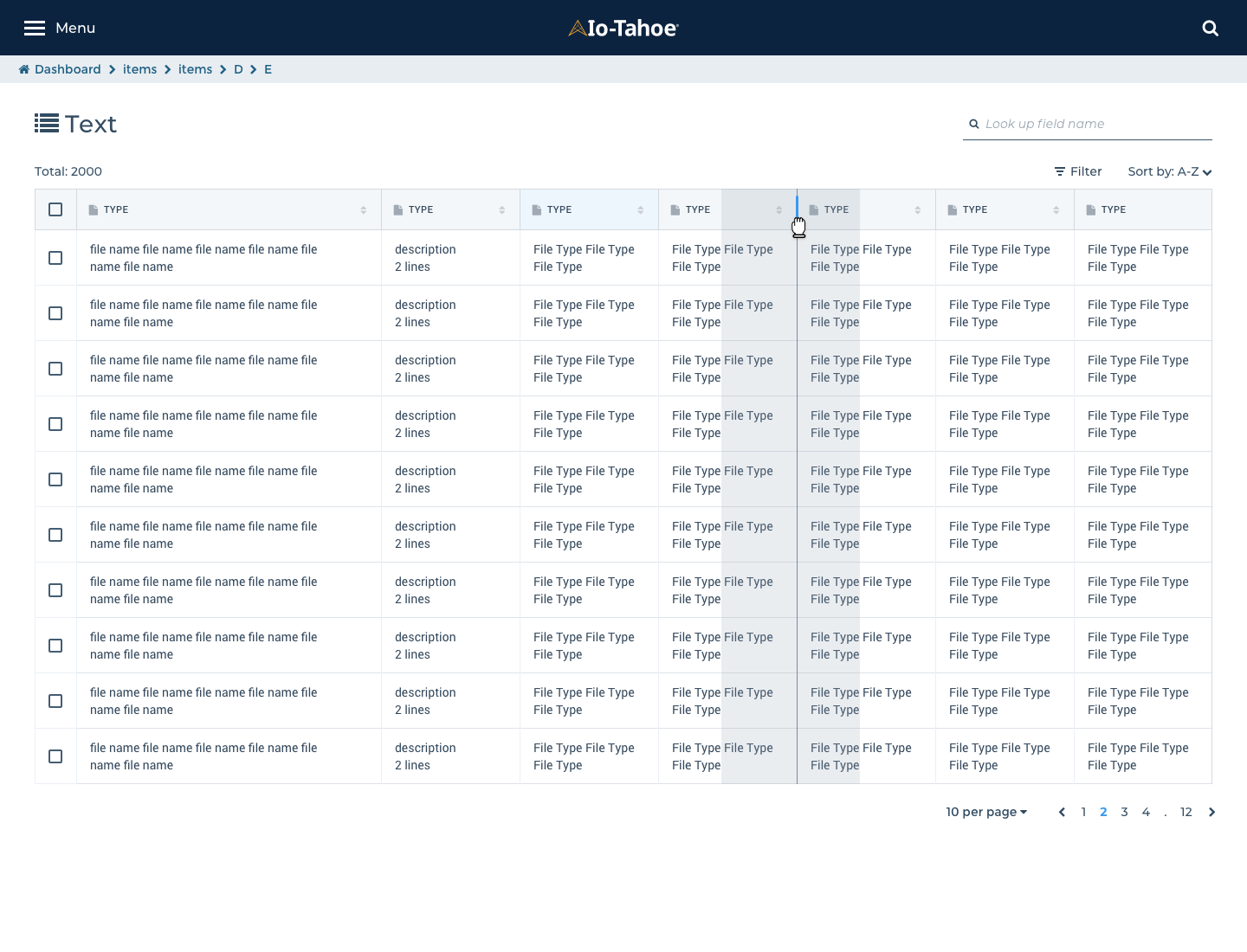
Data tables
Designing data tables is one of the major tasks for our redesign. At the end of the steps, users will see data discovery results as in data tables most of the times.
• Consistent UI for all use cases: There were 6 different data table design across all products. Define all use cases as possible for correct implementation
• Enhanced filters: Filters were hidden and not easy to find relevant information from the table. References; https://airtable.com/ https://canvas.hubspot.com/patterns/tables https://www.enigma.com/
• Resizing option: Users can adjust the size of a row from small, medium or large
• Font size and colors are optimized for data platform considering accessibility.
• Reorder, show, and hide columns: We can't expect which columns are more important than others. Providing reordering, show & hide functionality users can customize their results.
Data table components

Small - Height 32
Medium - Height 48 with locking 1st columns
Large - Height 64; 2 lines
Expandable panel
Filter interaction - Add new filter
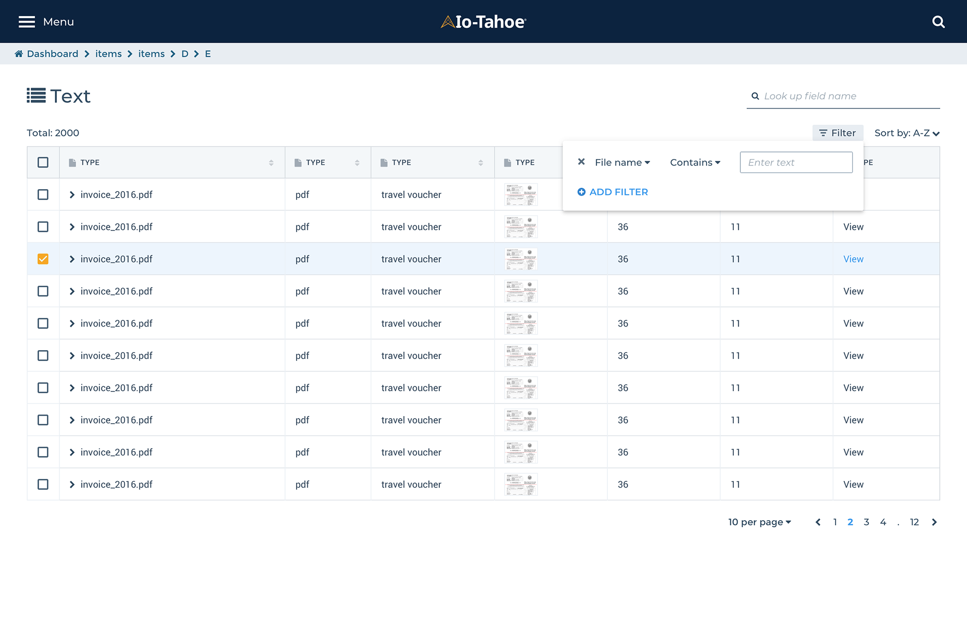
Filter interaction - predefined filter list

Table input - Edit or delete a row
Reordering columns
Following up
Every month we could see new versions of Sketch or plug-ins released. Sometimes we experience unexpected bugs either from Sketch or plug-ins. When designers export Sketch files to Zeplin, Marvel or InVision, they should make sure all symbols working well in each system. Otherwise, the symbols have to be detached from the design library until the bugs are fixed.
Every month we could see new versions of Sketch or plug-ins released. Sometimes we experience unexpected bugs either from Sketch or plug-ins. When designers export Sketch files to Zeplin, Marvel or InVision, they should make sure all symbols working well in each system. Otherwise, the symbols have to be detached from the design library until the bugs are fixed.