Role: Product(UX/UI) Design Lead
Platform: jpmorgan.com, chase.com
Vendor: IHS Markit
Project period: 8-month
Tools: Sketch, InVision and plug-ins
Credits: Loc Ho(Product), Melanie Ohana(Product), Michael Smith(UX Research), Natasha Park(UX Research), Aftab A(UX Research)
Platform: jpmorgan.com, chase.com
Vendor: IHS Markit
Project period: 8-month
Tools: Sketch, InVision and plug-ins
Credits: Loc Ho(Product), Melanie Ohana(Product), Michael Smith(UX Research), Natasha Park(UX Research), Aftab A(UX Research)
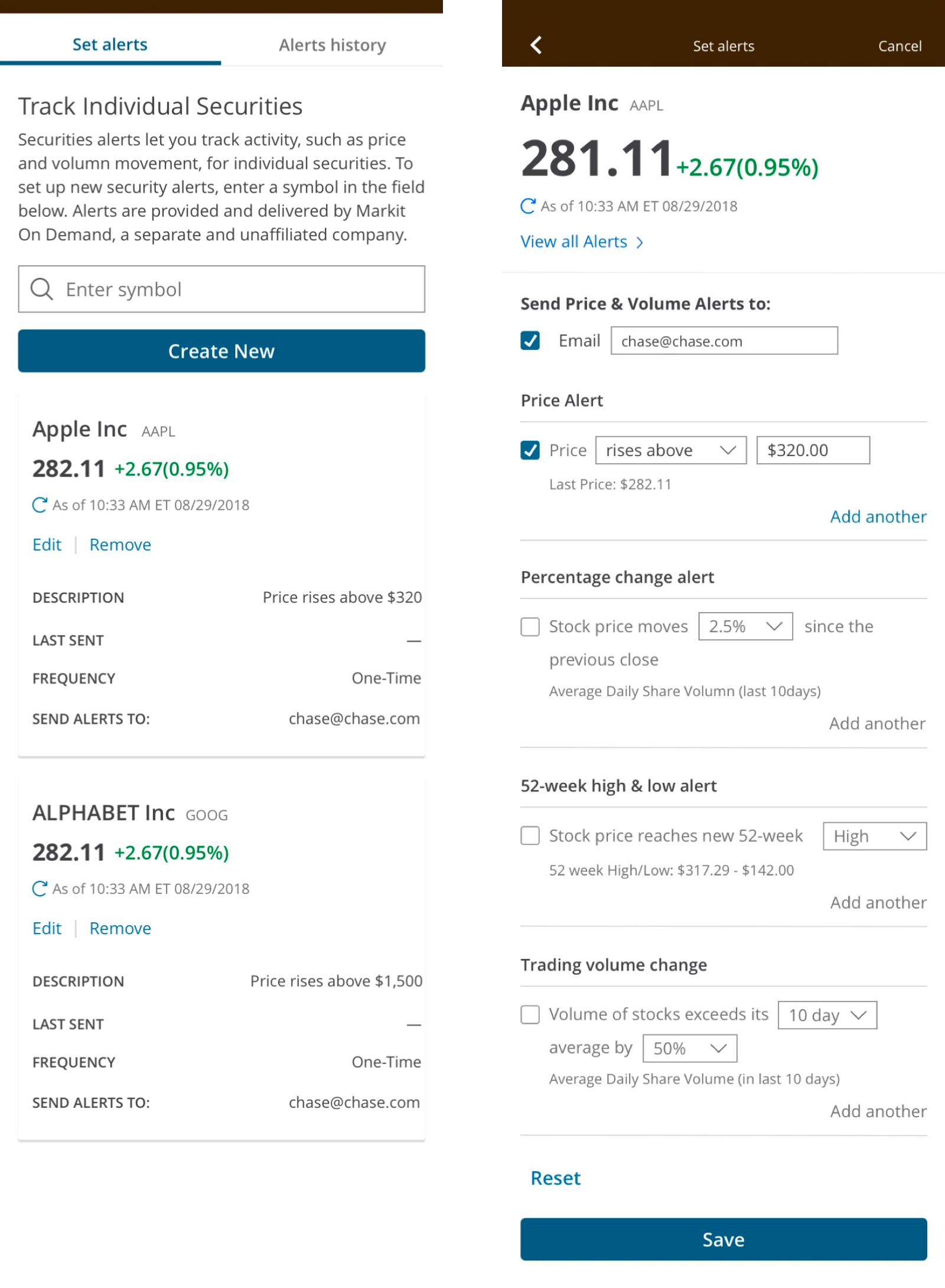
Pain points
• Chase.com clients didn't have any price alerts what most of our competitors have.
• Jpmorgan.com used a vendor, Factset for stock price alerts, but it wasn't user friendly and didn't support enough functionalities.
• Jpmorgan.com used a vendor, Factset for stock price alerts, but it wasn't user friendly and didn't support enough functionalities.
Designing Process
• Initial UX is based on IHS Markit alerts and we customize the design and features.
• Iterated user flows and UI designs based on 4-round qualitative usability testings
• Key user flows: Setting an alert in each entry point, Navigate alerts, Copy an alert
• Iterated user flows and UI designs based on 4-round qualitative usability testings
• Key user flows: Setting an alert in each entry point, Navigate alerts, Copy an alert
Qualitative Usability Testings
Method
60 minute 1-on-1 in depth interview sessions with clickable InVision prototypes
Participants
7~10 investors recruited by Fieldwork in each round
$20k – 90k investable assets, $100k+ investable assets
7~10 investors recruited by Fieldwork in each round
$20k – 90k investable assets, $100k+ investable assets
Analysis
Used affinity clustering to identify
common issues, behaviors, and themes.
Used affinity clustering to identify
common issues, behaviors, and themes.
User Testing: Round 1
Overview
Participants were tasked with navigating to Positions from the Investments L1 header, and asked to set an alert for the Apple stock they own. After setting that alert, participants were asked to set a checking account balance alert. We counterbalanced across the study population using two versions.
Research Questions
• Are users able to find the Set Alerts button successfully?
• Can users set an investment alert successfully?
• Do users comprehend the Copy feature?
• Which version’s navigation hierarchy supports the users’ journey better?
• Can users set an investment alert successfully?
• Do users comprehend the Copy feature?
• Which version’s navigation hierarchy supports the users’ journey better?
Round 1 Results
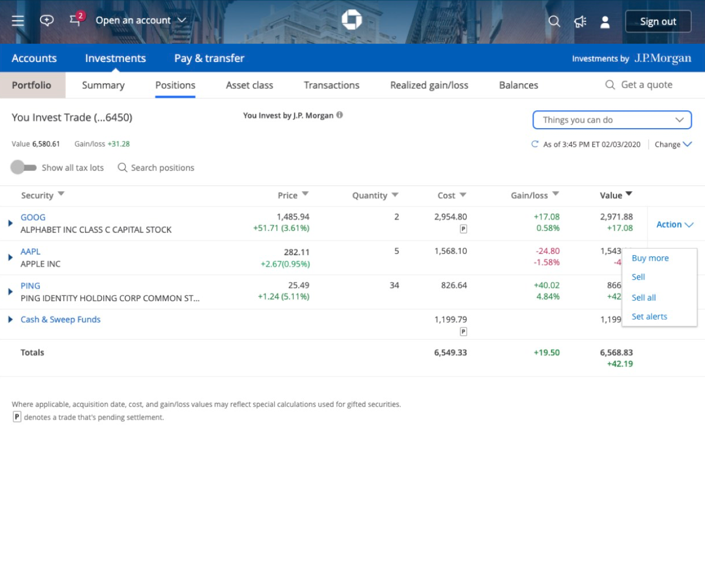
Finding the Set Alerts button
The Set Alerts button within the Action column dropdown on an individual position blade was located successfully by users. Also, prior to locating Positions (L2 sub-header) when on the investments summary page, some users clicked on Things you can do or the header hamburger menu. This suggests that users are looking for a separate alerts section (i.e., they are not imagining completing the task contextually).
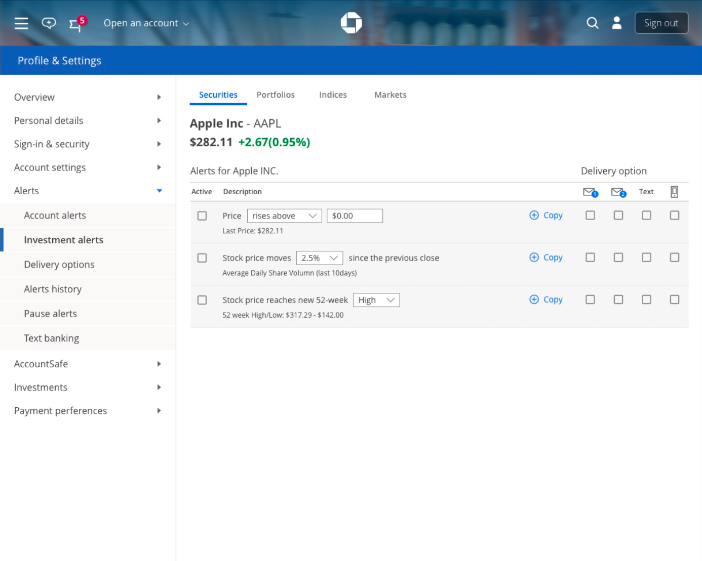
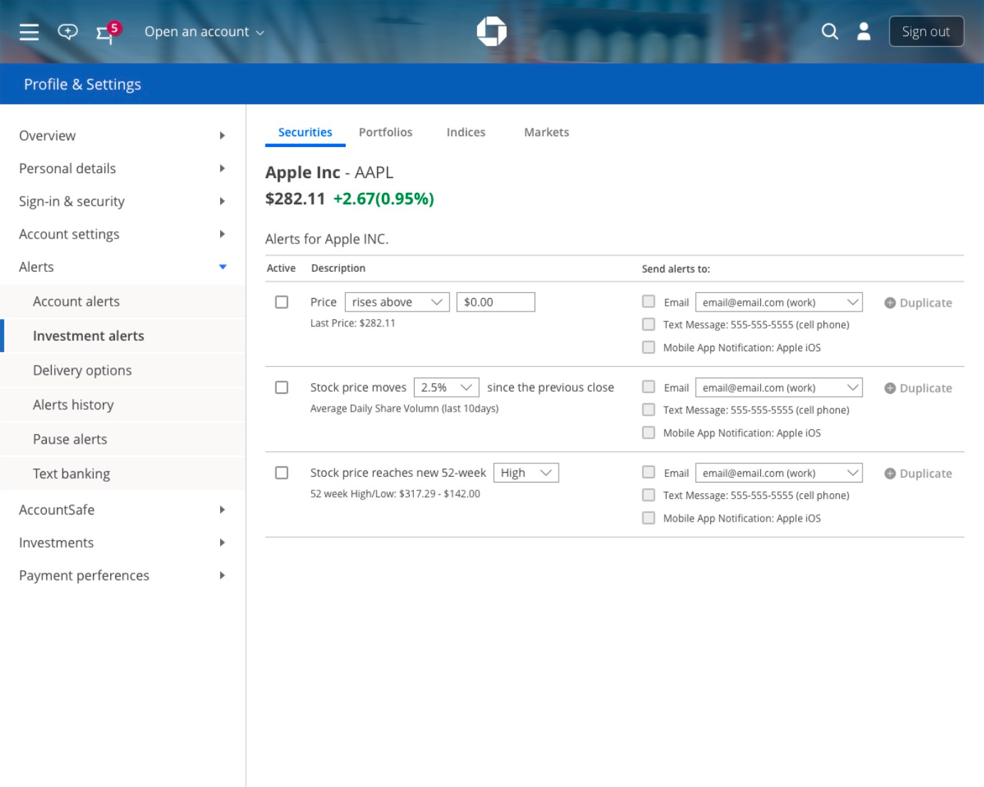
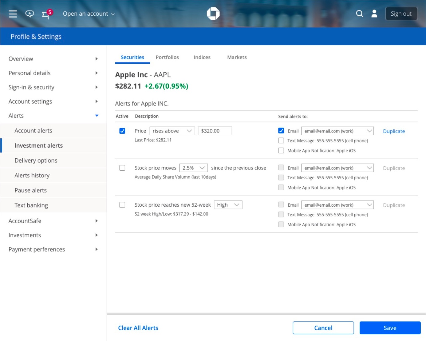
Setting an Alert
Users failed to perceive the Active column checkbox as a step in the alert-setting workflow We observed some users attempting to skip the Delivery options section when setting alerts. Iconography for push notification and 2nd email delivery options was observed to cause some confusion.

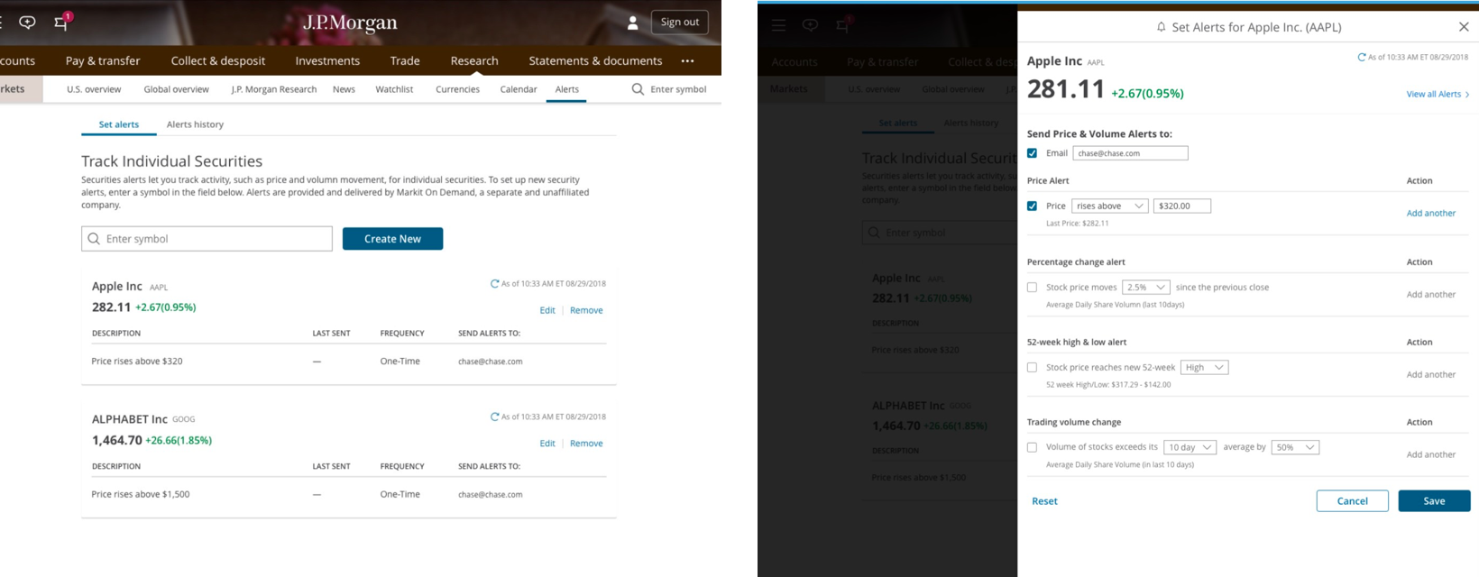
Copy feature
The word ‘Copy’ failed to communicate its function. Users stated that it felt ambiguous. Also, due to the placement of the Copy button, some users misunderstood the feature’s function.
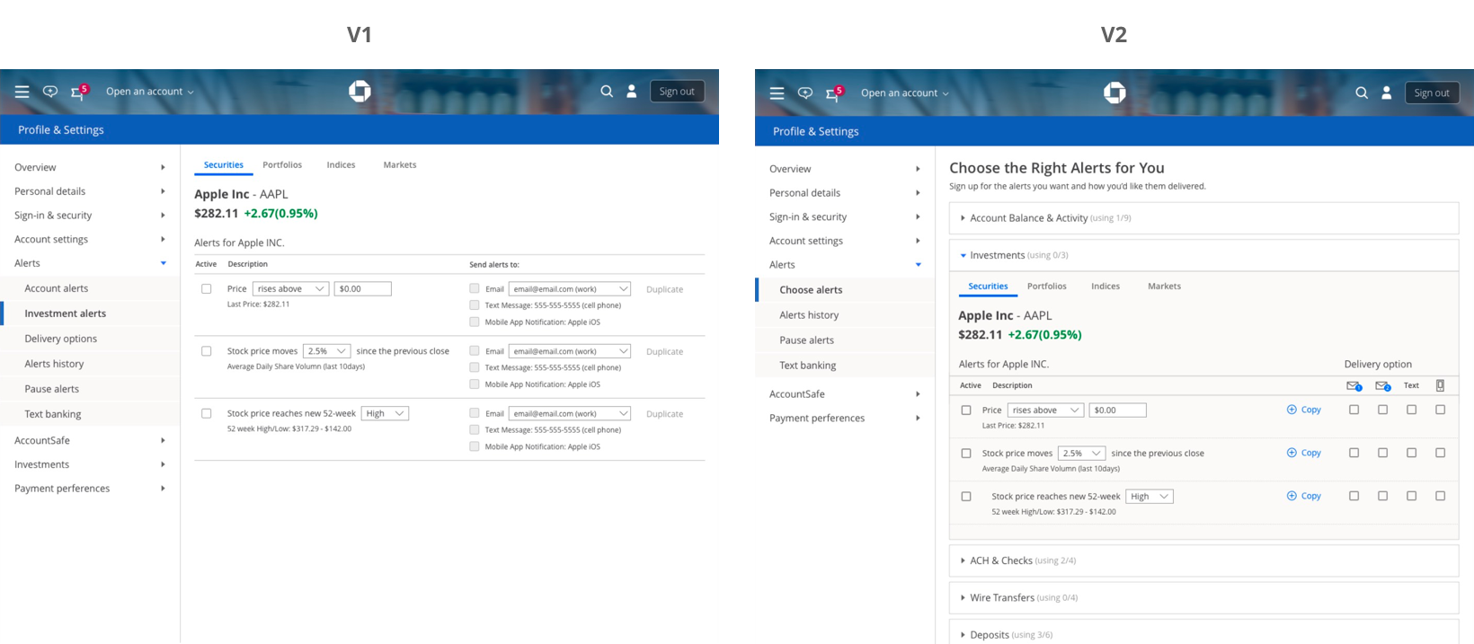
Prototype V1 vs. Prototype V2
V1 (investment alerts as separate left rail nav item) caused less friction when executing the task. However, some users struggled to locate Account alerts immediately. We observed that they clicked on Overview prior to discovering Account alerts. V2 (investments alerts in-line with banking alerts) performed poorly. We observed that users scan the main frame’s accordion menu from the focused-blade downwards, disregarding the menu options above. This suggests that landing the user within a pre-expanded accordion does not provide the user enough context to discover other options. Based on these observations, we recommend Version 1.
User Testing: Round 2
Overview
Participants were tasked with navigating to Positions from the Investments L1 header, and asked to set an alert for the Apple stock they own. After setting that alert, participants were asked to set a checking account balance alert. We counterbalanced across the study population using two versions.
Research Questions
• Can users set an investment alert successfully?
• Do users comprehend the Duplicate feature?
• Which version’s navigation hierarchy supports the users’ journey better?
• Do users comprehend the Duplicate feature?
• Which version’s navigation hierarchy supports the users’ journey better?
Round 2 Results
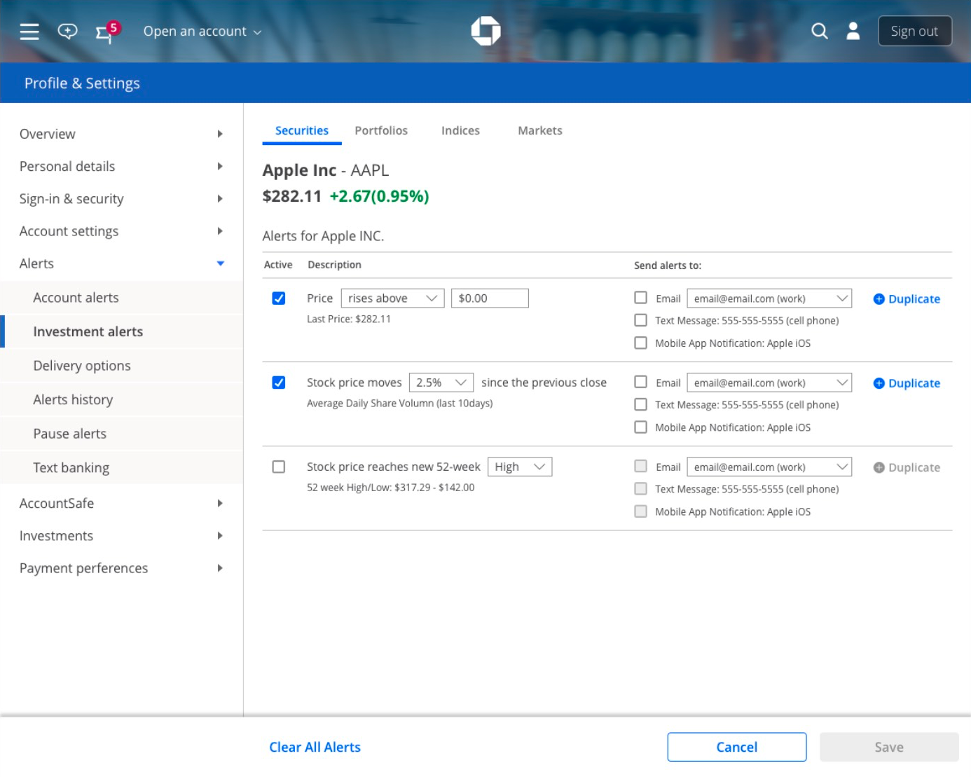
Setting an Alert
Users successfully set an investment alert. We observed no blockers. The delivery options were understood clearly by users. In previous rounds of research, we observed some friction when users select delivery options that were identified using icons. The version tested here displayed delivery options identified using text descriptions, and we observed a marked improvement in users ability to complete the task. Based on these observations, we have no further recommendations.
Duplicate feature
The word ‘Duplicate’ failed to communicate its function. Users stated that it felt ambiguous. A card sorting activity failed to identify an alternative word that communicated properly the feature’s intention. Also, due to the placement of the Duplicate button, some users misunderstood the feature’s function.
Information architecture: location of investment alerts (Prototype V1 vs V2)
V1 (investment alerts as separate left rail nav item) caused minor friction because some users struggled to locate Account alerts immediately. We observed that Overview was selected prior to discovering Account alerts.
V2 (investments alerts in-line with banking alerts) caused slightly more friction. We observed that the main frame’s accordion menu was scanned from the focused-blade downwards, disregarding the menu options above. This suggests that landing the user within a pre-expanded accordion does not provide the user enough context to discover other options reliably.
Based on these observations, we recommend conducting a quantitative tree-jacking study to determine the navigation path that aligns with our users’ mental model.

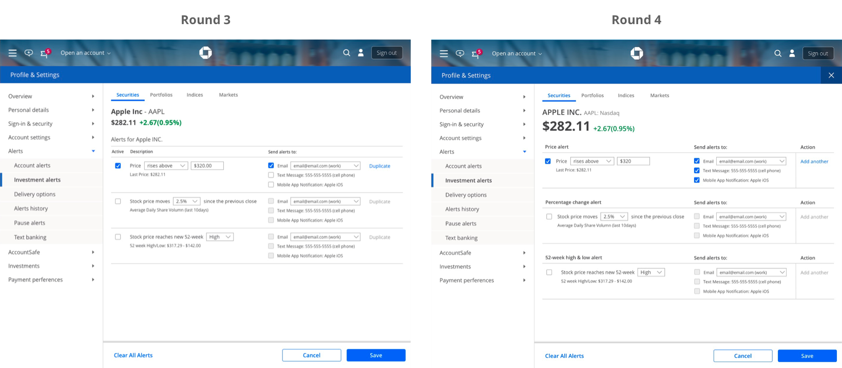
User Testing: Round 3
Overview
Participants were tasked with navigating to the set alert page (having all paths accessible in the prototype), and asked to set an alert for the Apple stock they own.
Research Questions
• What path do users take to navigate to the Set Alerts page?
• Can users set an investment alert successfully?
• Do users comprehend the Duplicate feature?
• Can users set an investment alert successfully?
• Do users comprehend the Duplicate feature?
Round 3 Results
Set Alerts button navigation in Quote page
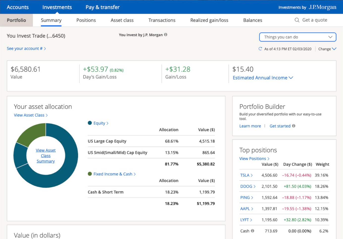
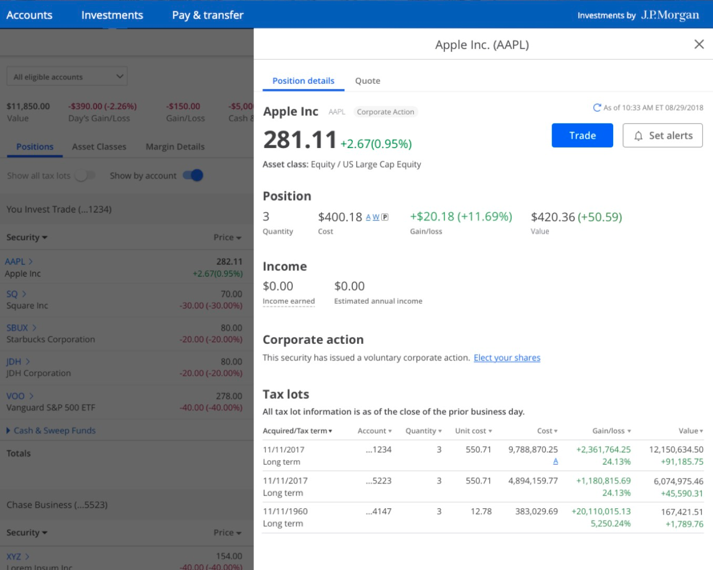
We observed that users successfully navigated from the dashboard to the Set Alerts button via Quote page. A majority of users accessed this quote page by selecting the position (i.e, Apple) within the Top positions tile located on the investment dashboard.
Set Alerts button navigation in Investments Dashboard
Because a majority of users took a shortcut to a position via the Top positions tile, we suspect that the conditions of the test may have biased users’ interactions. As such, we recommend excluding the desired position from the summary page in subsequent rounds of Investment Alerts testing. Without a shortcut to a position provided on the summary page, we would gain additional insight into users’ navigation expectations.
Setting an alert
Upon landing on the Investment alerts settings page, we observed that users were able to identify a target price, select a delivery option, and save the alert. We observed no usability blockers in this portion of the workflow.
Duplicate button
The Duplicate button failed to communicate its functionality to users. We observed some users link its functionality to the delivery options. We observed a large majority of users utilize the hover state description as an aid. Even so, the functionality of the button was still unclear to some users. Based on these observations, we recommend iterating the design to clarify the affordances of the subsequent duplicate screen to make clear to users the intended interaction.
User Testing: Round 4
Overview
Participants were tasked with navigating to the set alert page (having all paths accessible in the prototype), and asked to set an alert for the Apple stock they own.
Research Questions
• What path do users take to navigate to the Set Alerts page?
• Can users set an investment alert successfully?
• Did the new split alert-type design better support the users understanding of the duplicate button over previously tested variants?
• Can users set an investment alert successfully?
• Did the new split alert-type design better support the users understanding of the duplicate button over previously tested variants?
Round 4 Results
Set Alerts button navigation
We observed that users successfully located the Set alerts button on the Position Details slide-in page. Previous research has suggested that users expect multiple entry points into the Set Alerts workflow.
Setting an alert
Upon landing on the Investment alerts settings page, we observed that users were able to identify a target price, select a delivery option, and save the alert. As noted in prior research engagements dating back to February 2020, we observed no usability blockers in the alerts setting experience.
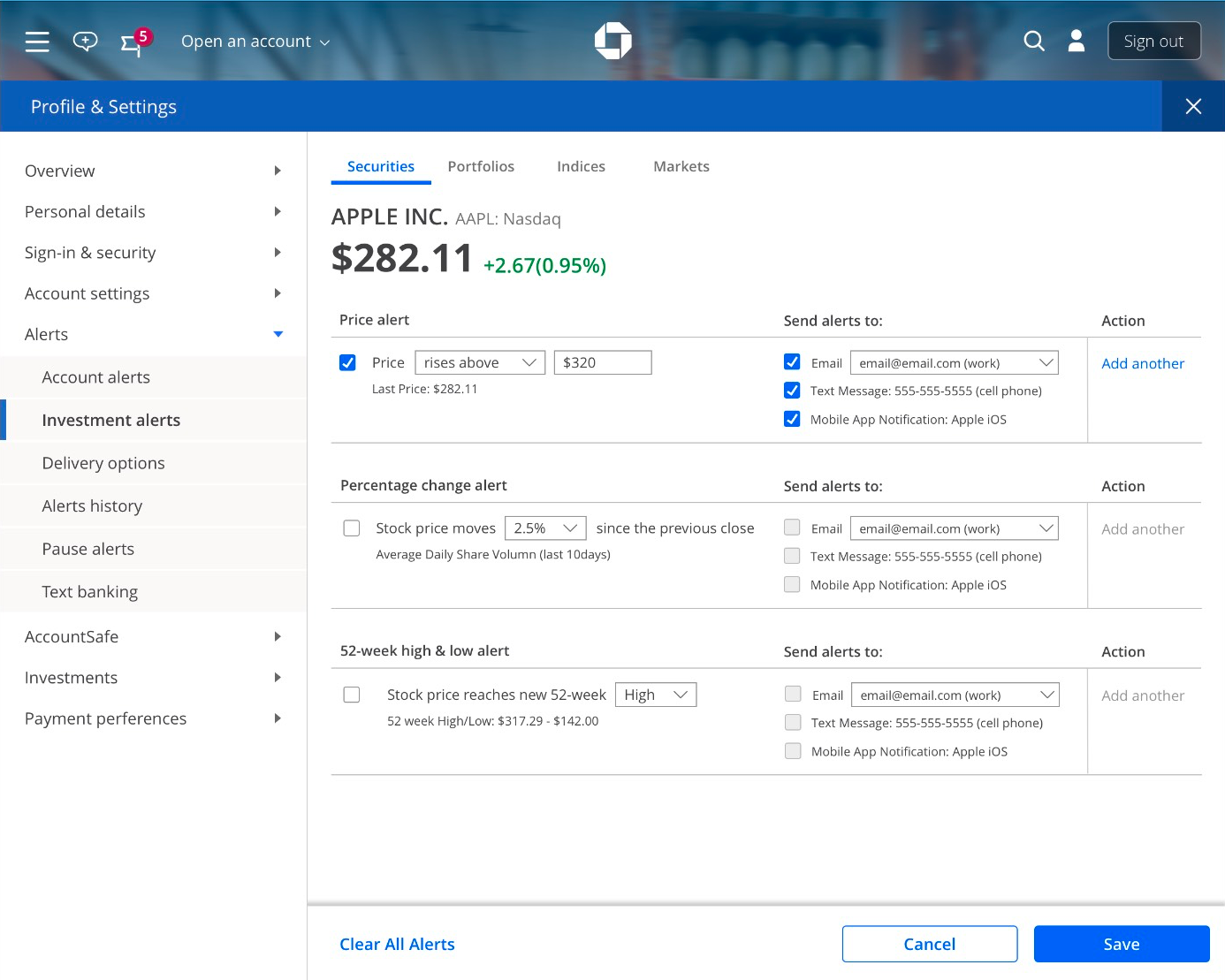
Duplicate button
We observed that users were able to articulate an accurate understanding of the Duplicate buttons’ intended functionality. Past research revealed that users struggled to imagine what the Duplicate button might do. Based on this observation, we can infer the added visual distance placed between alert types — and the naming of those alert types — in this version (Tested: May 19-20th) of the prototype were successful in scaffolding the users’ understanding and confident engagement with the Duplicate button.
Finalize Design Concept
• After 4-round qualitative user researches, we've finalized the design concept
• Design screens for the mobile and tablet
• Introduce the concept to business leaders to get funded
• The business decided to build the feature for jpmorgan.com first in and then for chase.com
• Design screens for the mobile and tablet
• Introduce the concept to business leaders to get funded
• The business decided to build the feature for jpmorgan.com first in and then for chase.com