Role: Product(UX/UI) Design, user research for Cornerstone, centralized big data platform. 3 product designers working collaboratively and lead each key feature of Cornerstone.
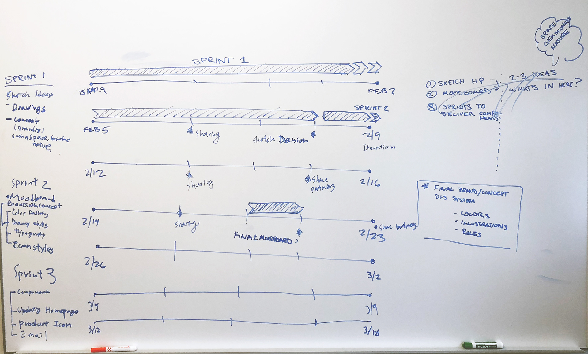
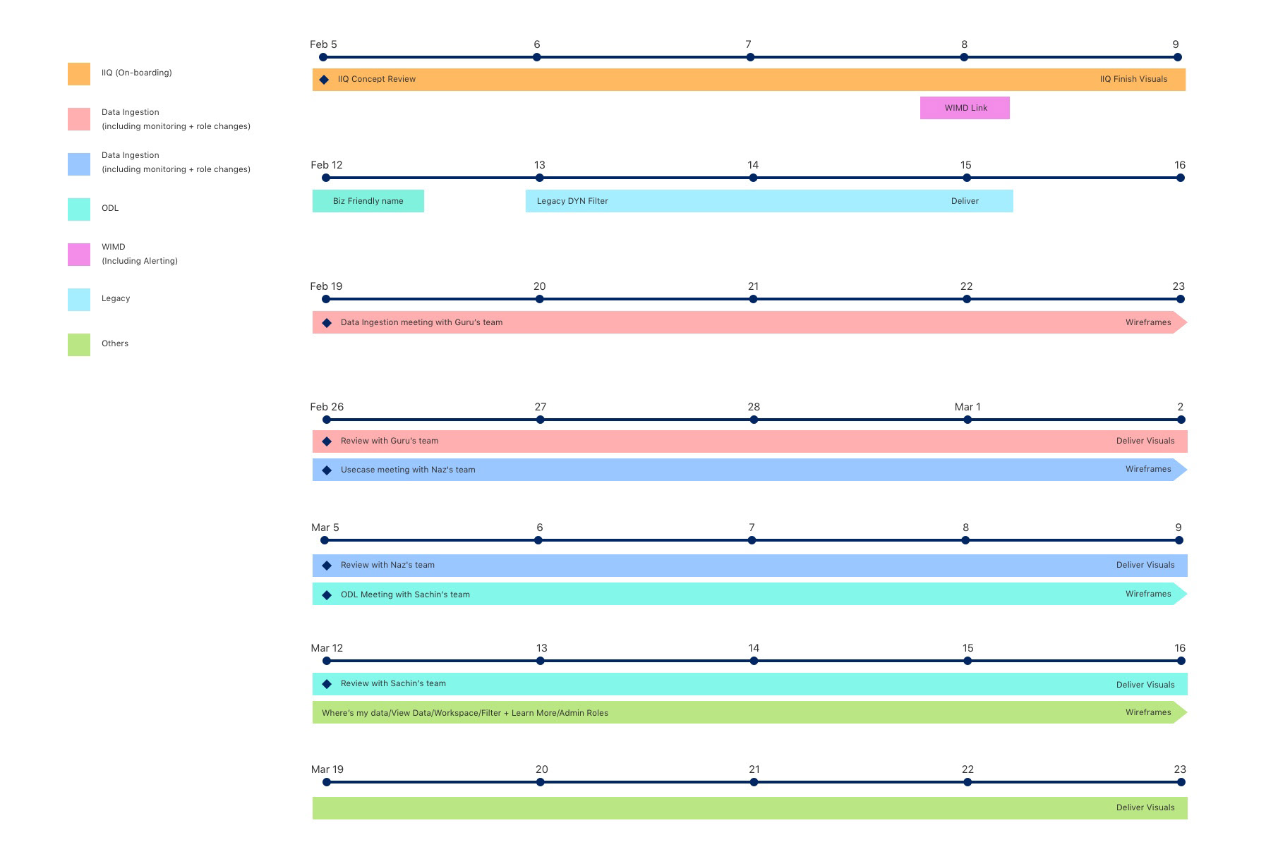
Process: All feature designs are planned with product owners and tech team by agile process. (2 weeks sprint)
Tools: Sketch, InVision and plug-ins
Credits: Thomas Katavic, Byron Escobar, Cristian Lugo
Process: All feature designs are planned with product owners and tech team by agile process. (2 weeks sprint)
Tools: Sketch, InVision and plug-ins
Credits: Thomas Katavic, Byron Escobar, Cristian Lugo
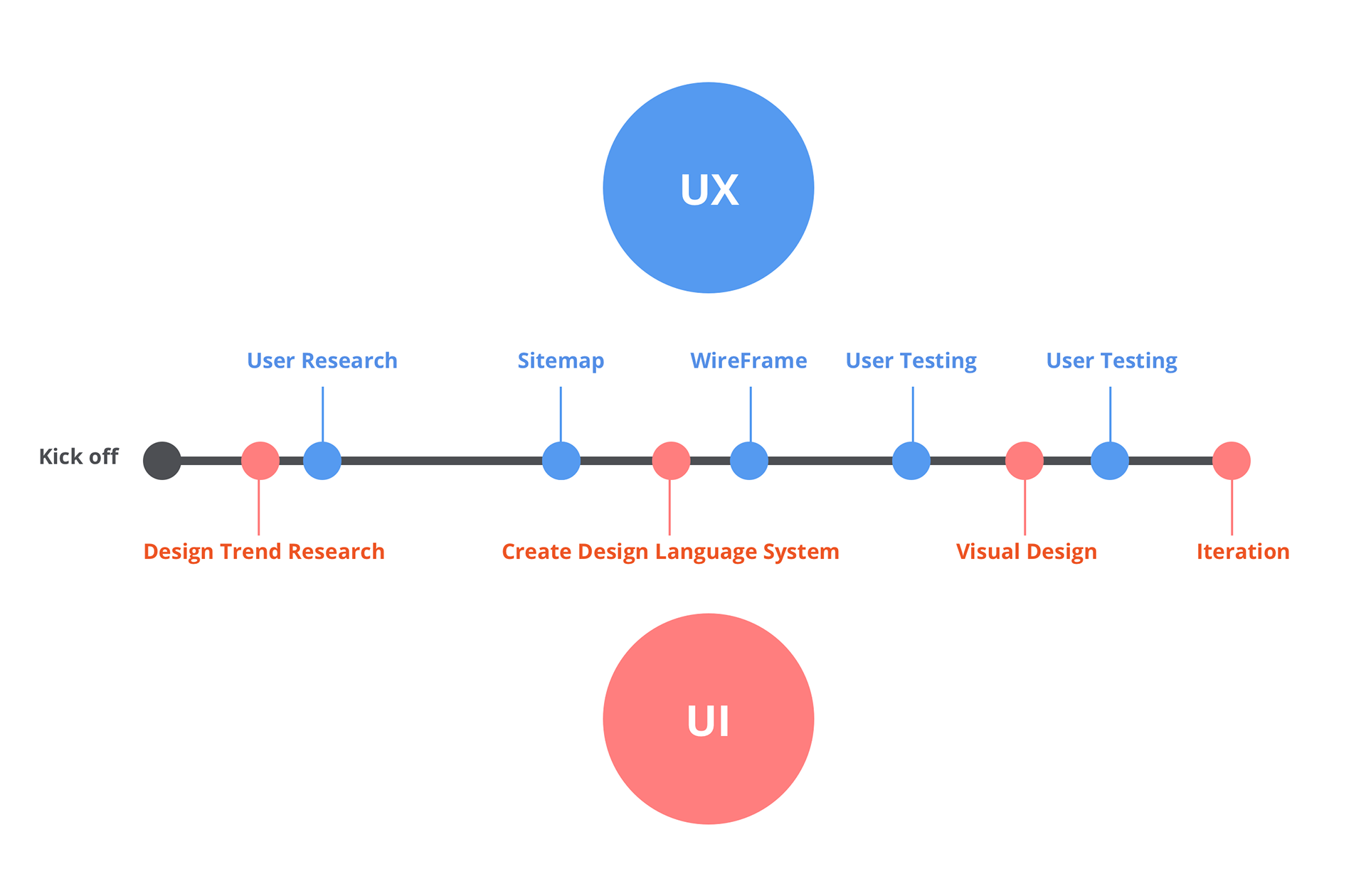
Designing Process
Planning and Scheduling
Plan product design schedule including entire UX/UI process and share with product owner and stakeholders for alignments. Starts with user research defining what the key problems are in our existing product.
Buckets of opportunity areas we have started identifying
MISSING FEATURES
There are both missing sections (e.g. reporting) and missing features of existing sections (e.g. UC enhancements) that need to be designed
USABILITY PROBLEMS
Existing features of the platform exhibit some usability problems we should address, e.g. search interaction model
SILOED FEATURES
Features are experienced in silos, e.g. the lack of connection between searching for data and building a use case
ADVANCED USER IA
The platform’s information architecture, particularly its terminology, is specifically geared towards advanced data users
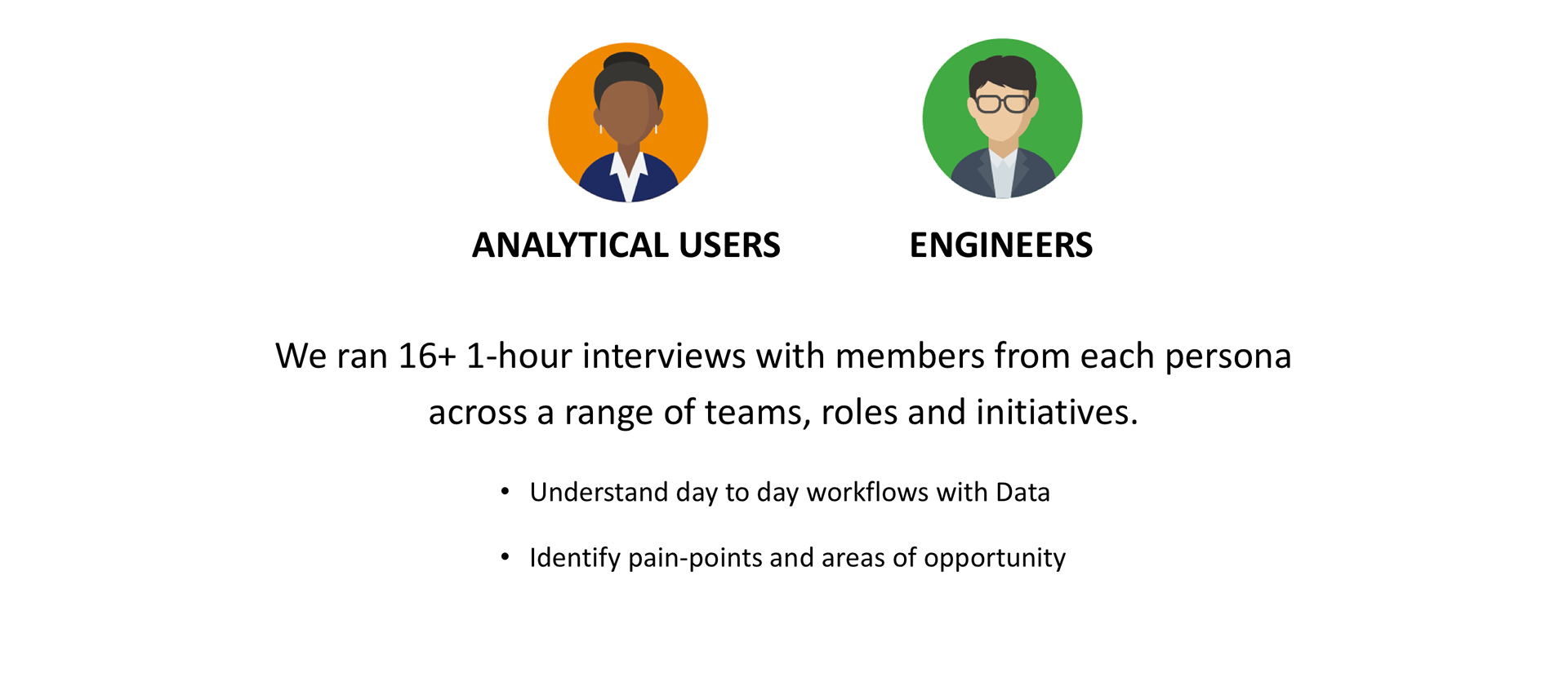
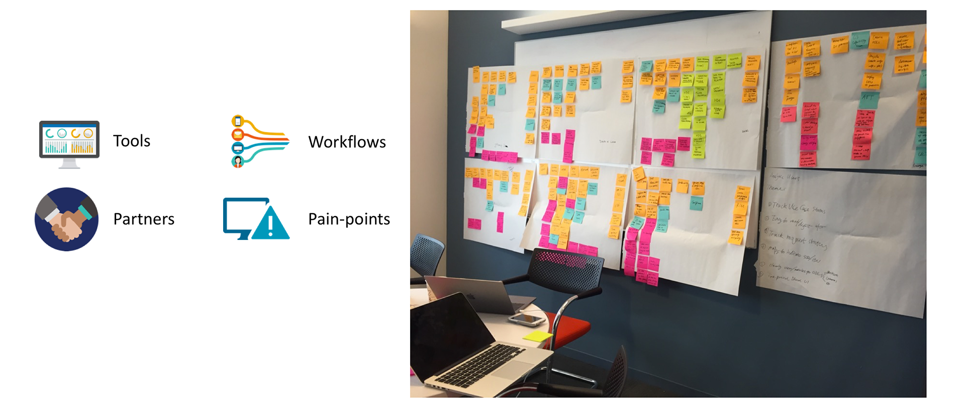
User Research to identify key-pain points from users
The persona was defined with product owners. When selecting user groups, closely working with product owners to find the right people to ask. Users are across a range of different business units, roles, and location; New York, Phoenix, Florida, and India. At least 2 designers joined each user research session. One designer leads the session and the other designer helped to record and note taking. It took about 3 weeks to finish 20 user interviews.
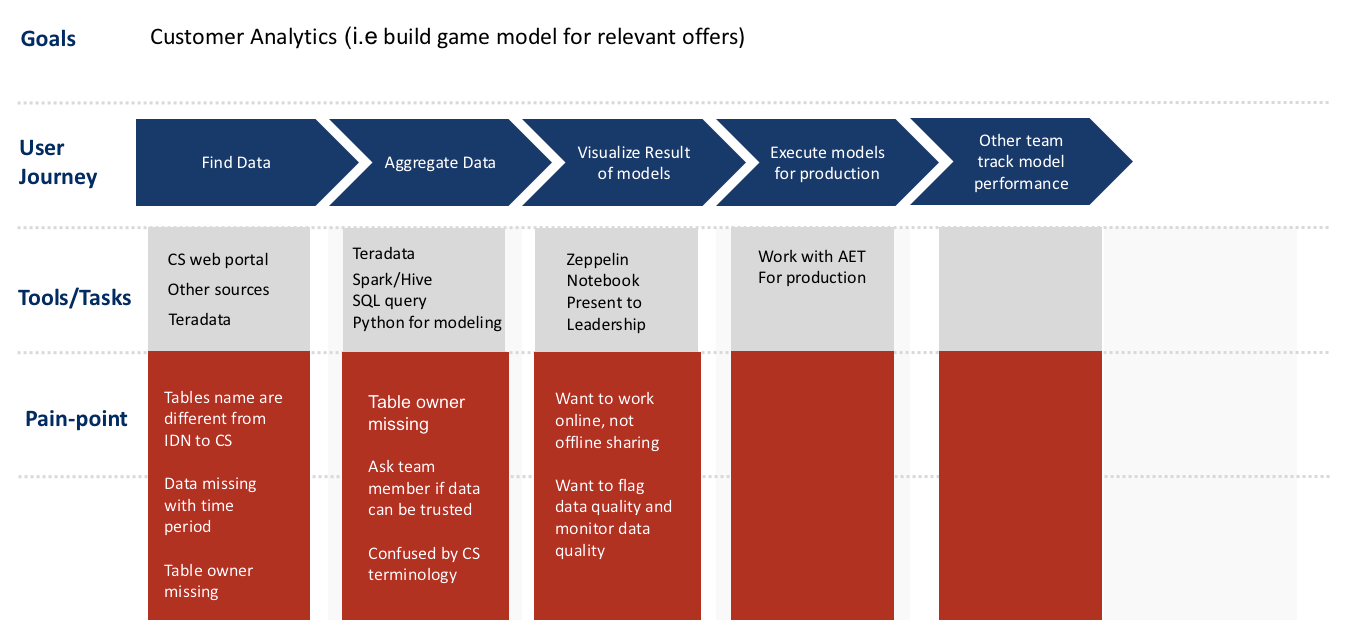
Visualized the existing user journeys
By collecting all user researches, we could build user journeys, and could see pain-points for existing the product.
User journeys
Each user has different goals for his or her job. Completed 20 user journey maps first and then transferred to digital to keep permanently and to share with partners.
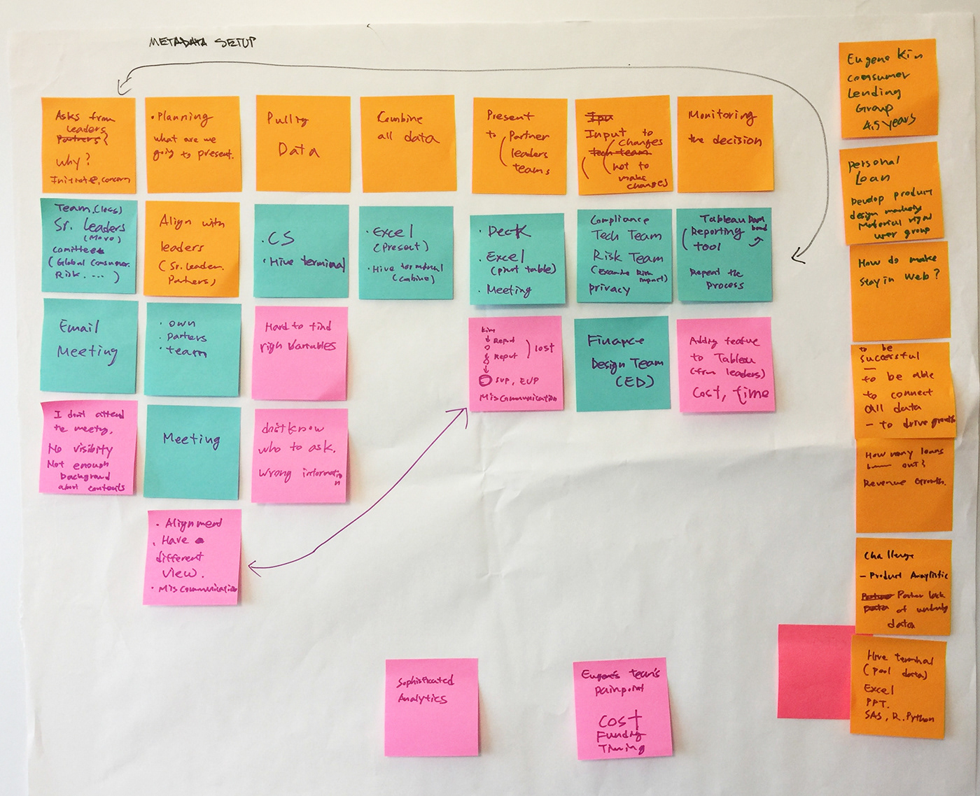
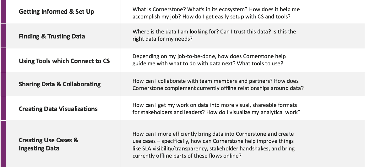
Find users' pain-points and natural patterns
We collected all pain-points from user journeys, and could find natural patterns from them. So we could group them in each theme.
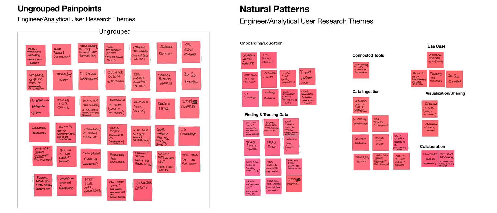
Top Issues surfaced through research
From the user research, we could identify top issues. Share these with product owners and stakeholders.
From the user research, we could identify top issues. Share these with product owners and stakeholders.
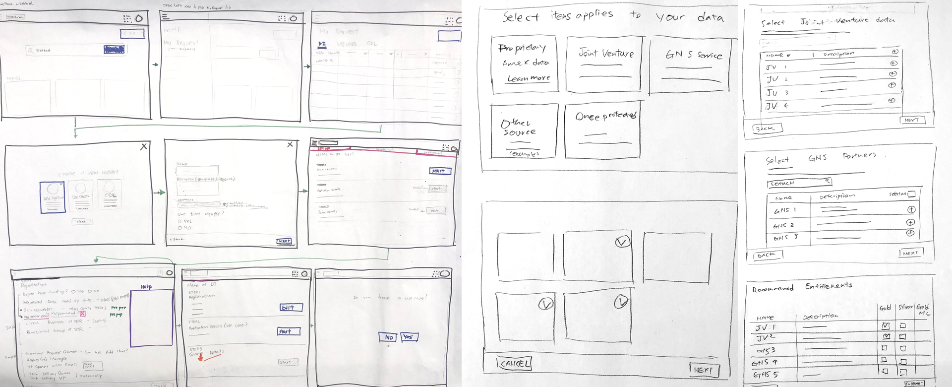
Concepts and ideation
We identified the problems and which feature we need to improve. Start with low-fidelity first. Always sketch multiple ideas on the paper and get feedbacks from other designers and stakeholders.
Share a design vision
Created interactive prototypes using a prototyping tool as https://principleformac.com/. Here are other options for prototypes. https://www.invisionapp.com/, https://marvelapp.com/, https://proto.io/, https://www.framer.com/, https://www.axure.com/. Prototypes really help stakeholders understanding a design vision and how it works in the actual product. If UI Kit is ready, we can create high fidelity wireframes using it for the prototype. After sharing the vision, we prioritized and adjusted features with product managers and engineers based on the team's timeline.
Created interactive prototypes using a prototyping tool as https://principleformac.com/. Here are other options for prototypes. https://www.invisionapp.com/, https://marvelapp.com/, https://proto.io/, https://www.framer.com/, https://www.axure.com/. Prototypes really help stakeholders understanding a design vision and how it works in the actual product. If UI Kit is ready, we can create high fidelity wireframes using it for the prototype. After sharing the vision, we prioritized and adjusted features with product managers and engineers based on the team's timeline.
Prioritize features from a design vision
Decide which feature will be developed first with product owners and engineering teams (Front-End/Back-End). We decided to start with finding & trusting data which were mentioned most of all users, then on-boarding to the product and getting access to data are followed.
Create high-fidelity prototypes and validate with users
Based on feedbacks from other designers and stakeholders, created high-fidelity wireframes. We did A/B testing with nominated users. Creates prototype using InvisionApp, Principles or marvel depending on the interactions.
Example: Save filter interaction option A
Example: Save filter interaction option B
A/B Testing Script Sample
User Research
Date:
Persona Type:
Participants:
Researchers:
Moderators:
Date:
Persona Type:
Participants:
Researchers:
Moderators:
Part 1:
Intro questions (2 min)
Hi everyone-- Thank you for taking the time to participate in our user research session today. We really appreciate it. (Team introduction) We are conducting a user study in order to design a user-friendly experience for you. When we start designing a new tool and continue iterating, it is very important to get perspective from the actual users. That is why we need your help. Please give us your honest and unbiased thoughts/feedback. We don’t have any ownership of the process or the current products. So, you won’t hurt our feelings. We will start with spending some time chatting with you and then take a look at a few screens.
We’ll ask a lot of questions, but we don’t want you to feel like we are testing you. We are here to learn and to figure out how we can design a product that you are happy to use in your day-to-day.
Any questions?
Thanks so much. Let’s take a look at the experience and get your thoughts.
Part 2: Task based Walkthrough (11 min)
Based on users’ feedbacks, we are introducing saving filter feature for you. We’ll be going through a clickable prototype, but please know that there is no right or wrong answer, this prototype is not meant to test your ability to do something, instead we are testing the product’s ability to be clear, useful and easy to use. We ask you to think aloud as you progress through the prototype. If you have any questions, if something is confusing, or any comments come to mind, please express your thoughts.
Suppose you’re saving your filter and calling back the filter you saved. Let’s click the screens one by one.
Can you take a look at this screen and describe what you see?
Are there anything bothering you? Anything missing?
Can you take a look at this screen and describe what you see?
Are there anything bothering you? Anything missing?
Here’s the second option. Let’s click the screens one by one.
Can you take a look at this screen and describe what you see?
Are there anything bothering you? Anything missing?
Can you take a look at this screen and describe what you see?
Are there anything bothering you? Anything missing?
Overall (5 min)
Which option do you think more relevant for you? And why?
If Cornerstone has this feature, how often are you going to use it? Does it help you saving time for your job?
If Cornerstone has this feature, how often are you going to use it? Does it help you saving time for your job?
Additional Comments?
*Recognition: Do they understand their meaning and what they represent?
*Information scent: Can they guess what will happen once they interact with the icon?
*Recognition: Do they understand their meaning and what they represent?
*Information scent: Can they guess what will happen once they interact with the icon?
Part 3:
Wrap up (5 min)
That about wraps up our testing session today. Do you have any additional questions for us? Thanks again, for participating in our study. We appreciate your feedback and look forward to working with you more.
That about wraps up our testing session today. Do you have any additional questions for us? Thanks again, for participating in our study. We appreciate your feedback and look forward to working with you more.
Key Takeaways:
Design Iterations right before launch and after launch
As we develop, there could be unexpected scenarios from Front-End and Back-End. Also, designers are required intimately to communicate with developers about implementations and to find defects. After launching a product or new features, as a team product owner, designer and engineers collect all user feedbacks and decide how to fix or improve existing problems.
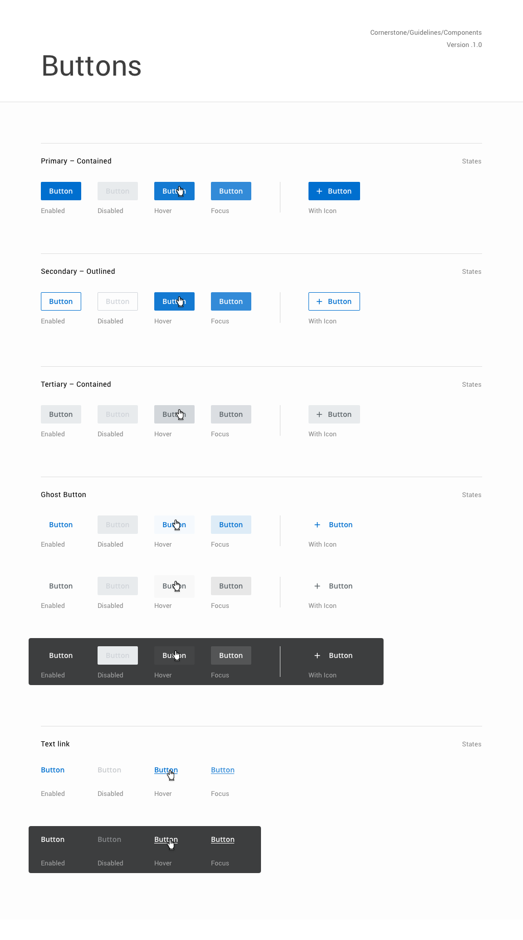
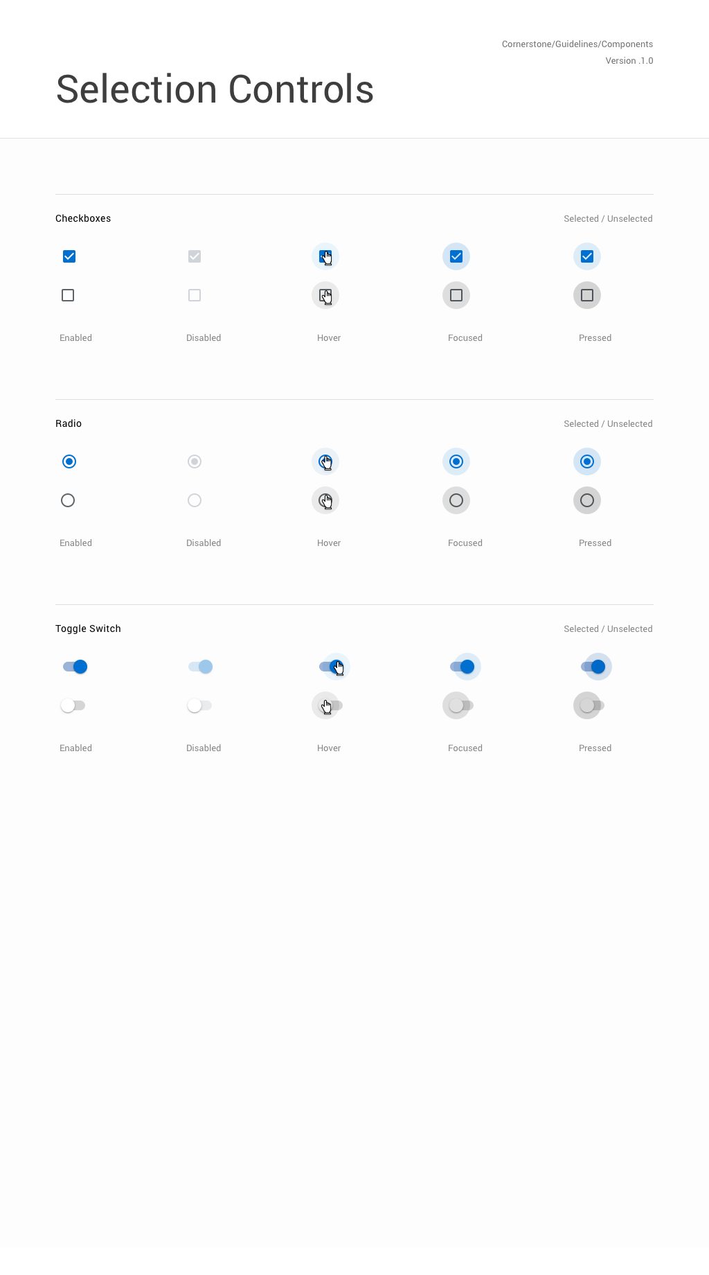
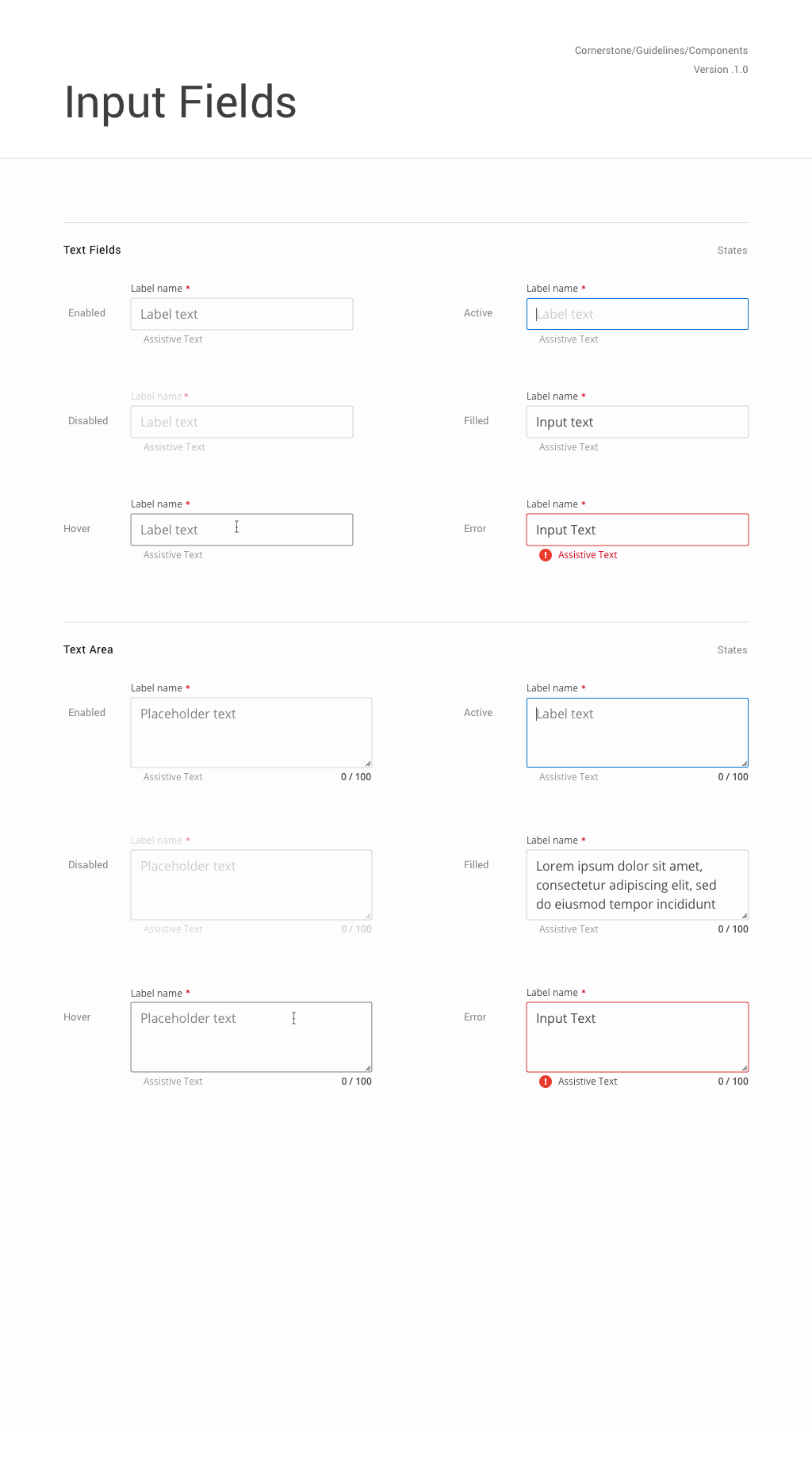
Visual Design and UI components
Design Language System for Cornerstone
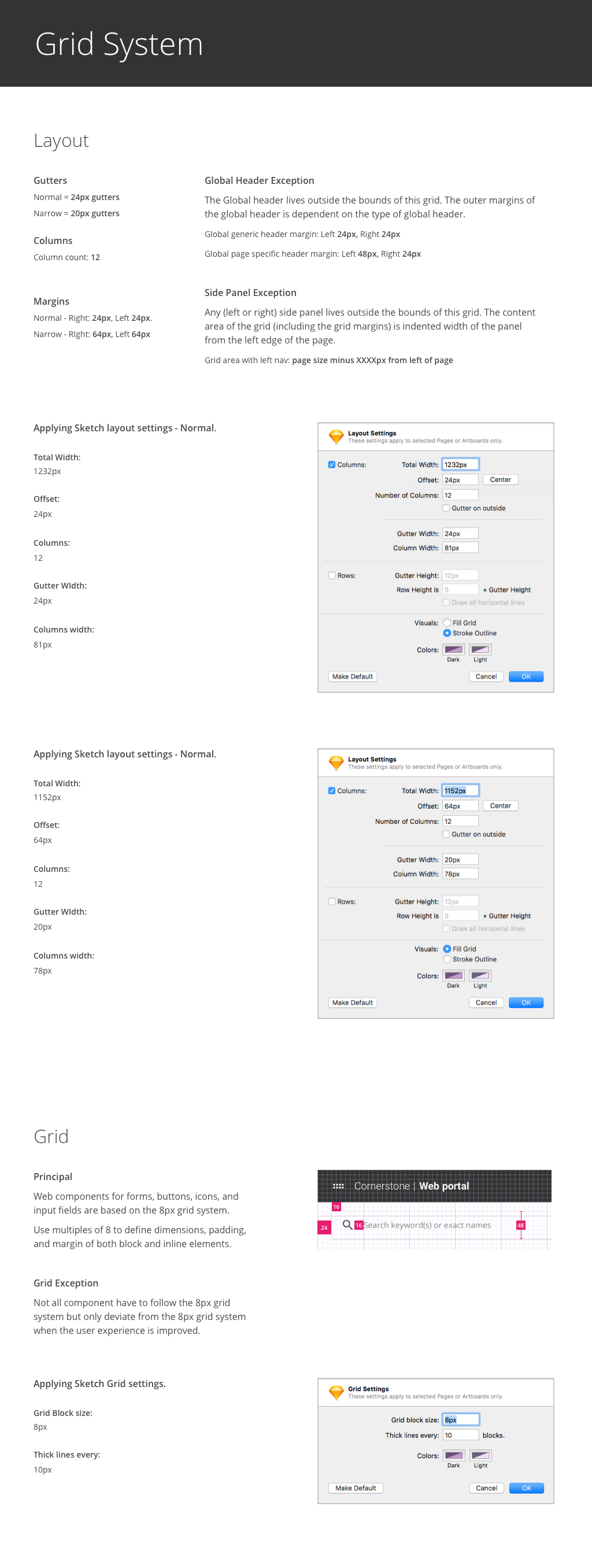
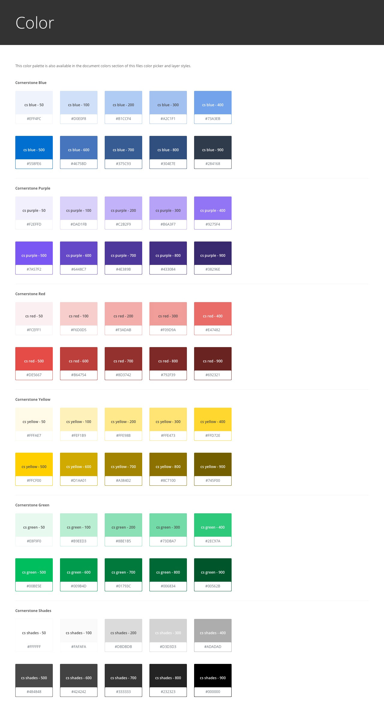
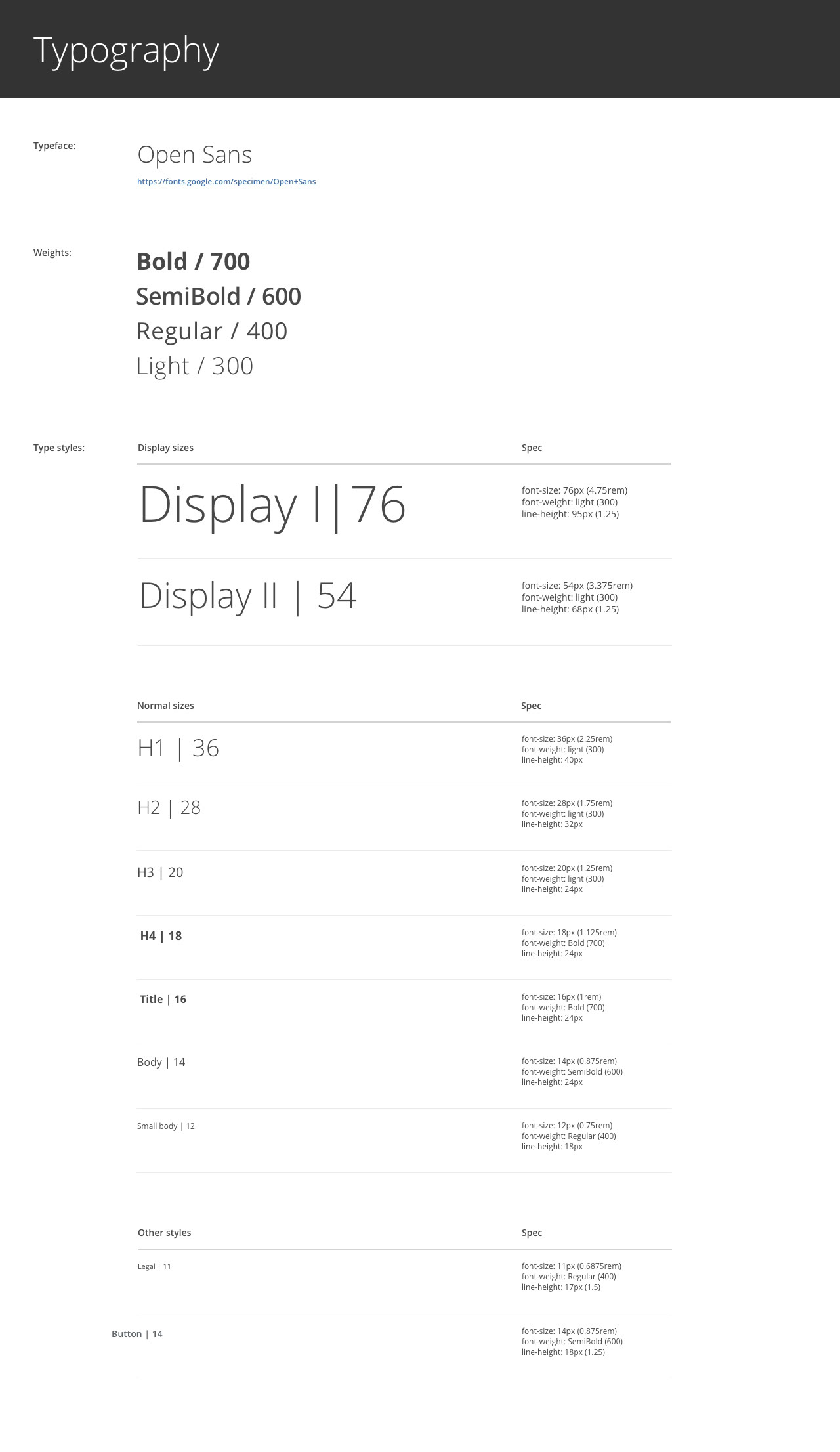
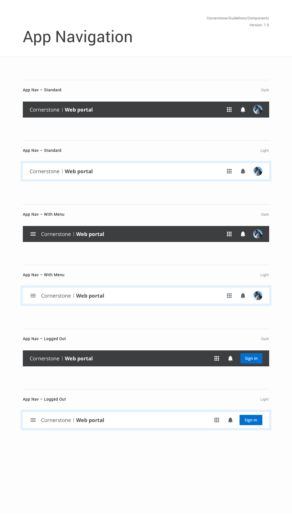
During user research, we started to create design language system for our products. Researched about design trends, optimized font size for data products and other data products. As a part of building design language system, defined gird system, colors and fonts first, and components after. All components are exported to Sketch Library in shared folder, so all screens using these components are always up-to-date.
Cornerstone homepage
Introduce all available products in Cornerstone. Users can sign-up or sign-in through the homepage. Our theme is space theme, which represent exploring enormous data space.
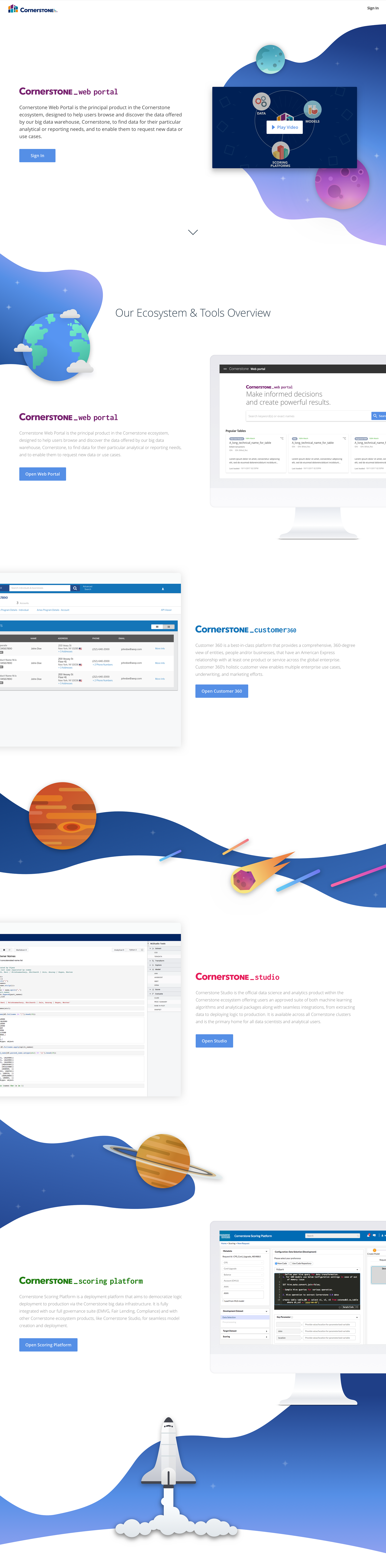
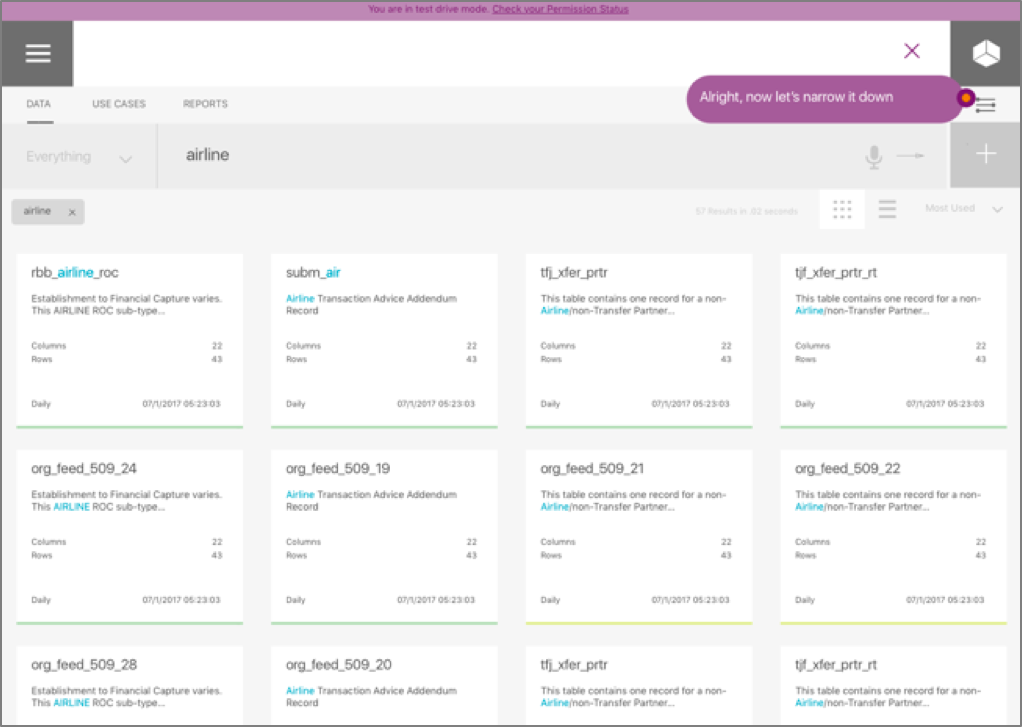
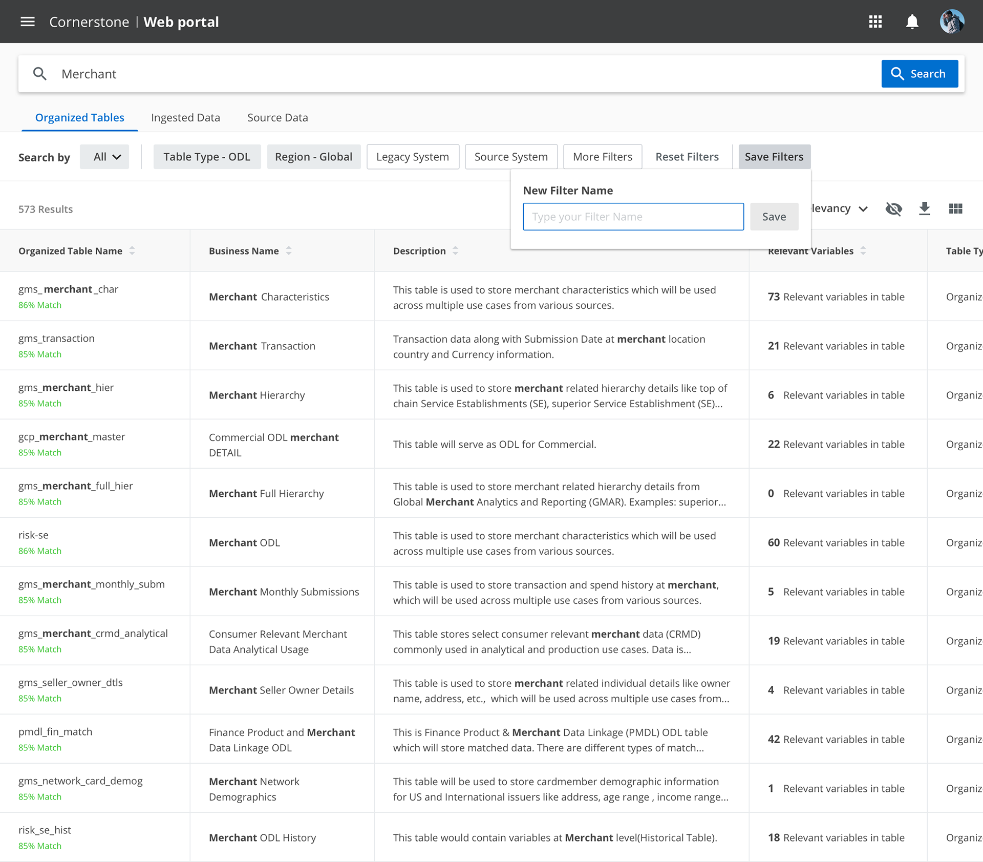
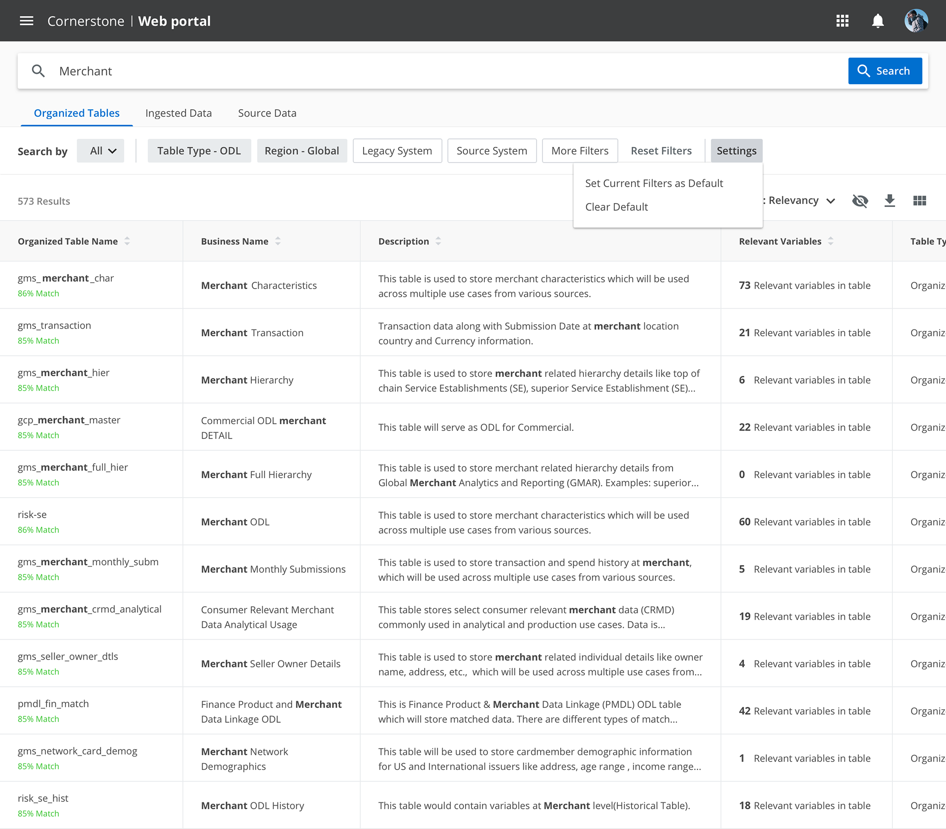
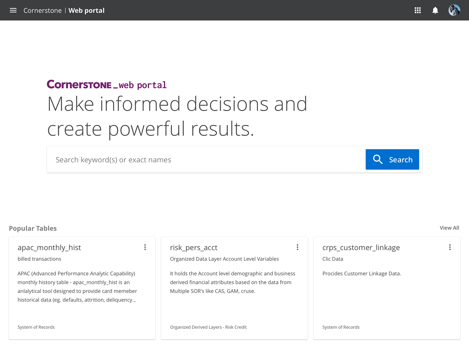
Cornerstone web portal landing page
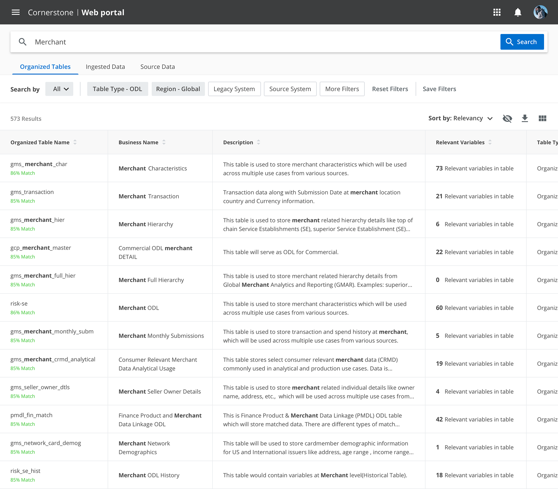
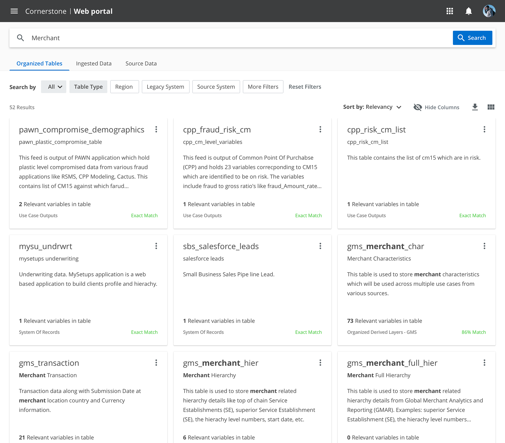
Users can find any American Express data tables and variables in this platform. e.g. If user search customer, all customer-related tables will be displayed ordered by relevancy. The relevancy is calculated by Algorithm.
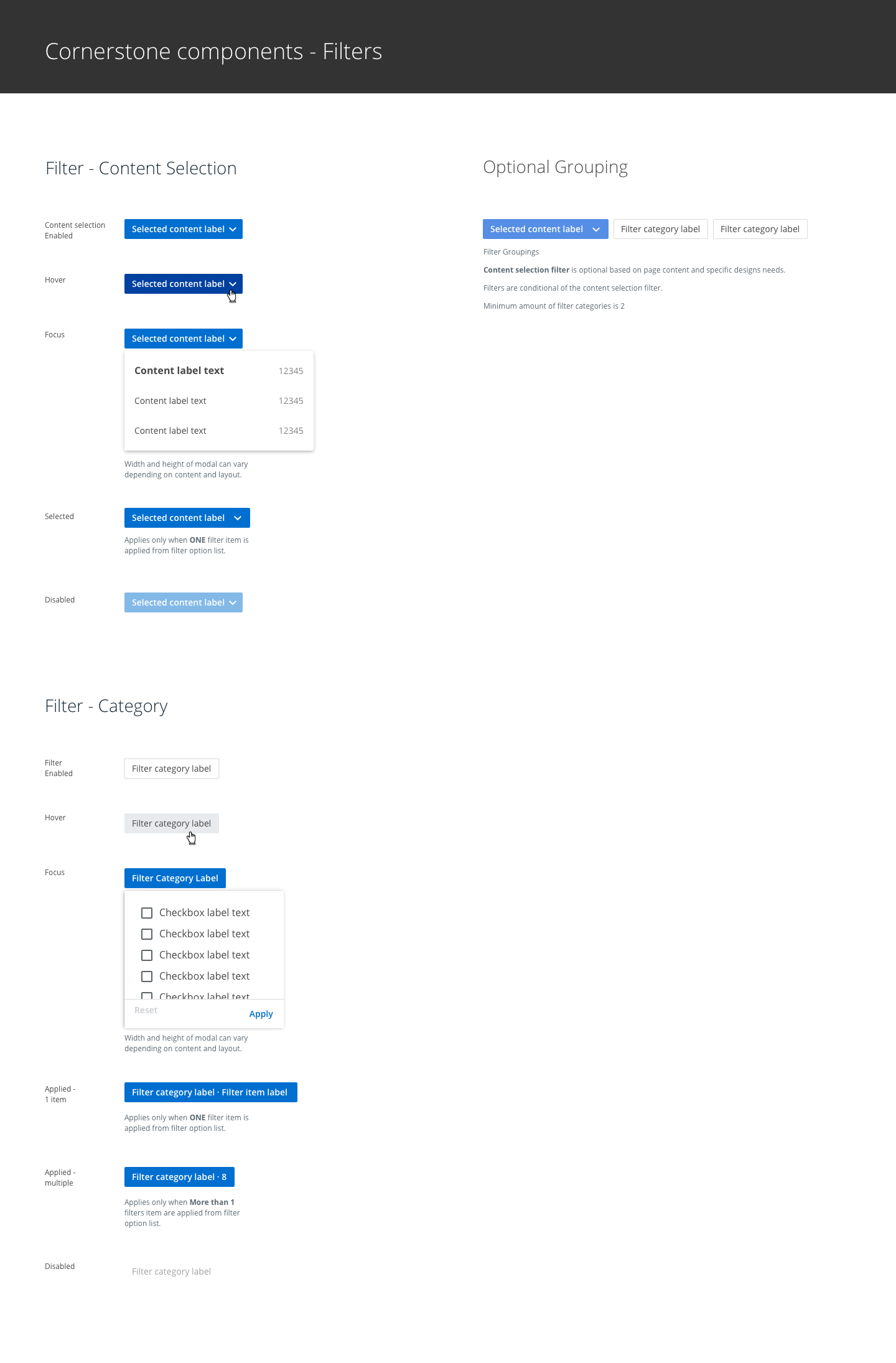
Search results with dynamic filters
Filters are decided by user research and testing with product owners. We re-ordered least-used filters in more filters. We provide list view and tile view for users depending on what they'd like to do. Our research showed the list view is more popular than tile view because users would like to see detail information as possible from result pages. Tile view works well who wants to compare tables before going to details.
Search results - tile view
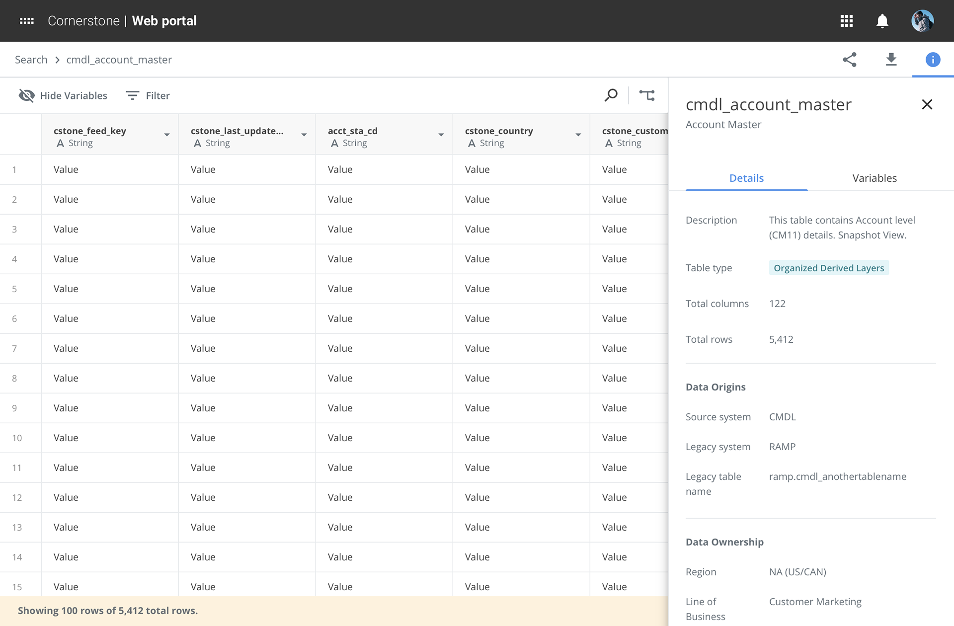
View Data
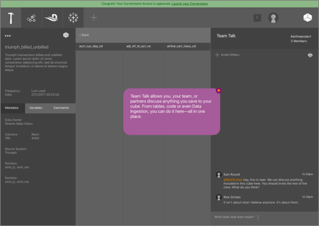
Once users click one of the tables, users are able to see all variables and sample data from the table. Because of performance, we decided to show 100 sample data with metadata of the table. Users can export or share the table with colleagues.
On-boarding to Cornerstone
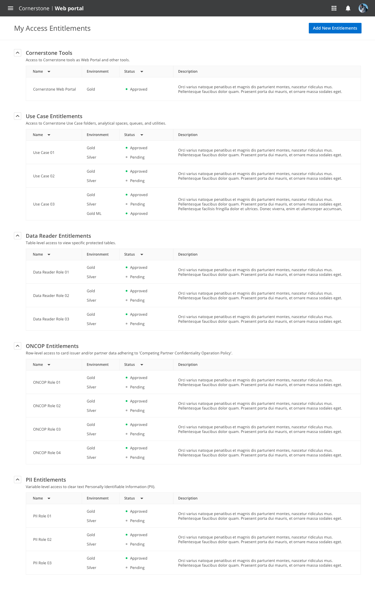
It was critical for users to get access to Cornerstone and data tables for their jobs. All processes were manual and people asked colleagues. Also, it took about 3 weeks to get approved. By asking user's role, team, and business units we automatically recommend roles and accesses for the user. They can come back to the product to check approval status or can submit additional roles for their jobs. The total process is now taking only 3 days compared to 3 weeks before. This feature is calculated saving $8million a year for the company.
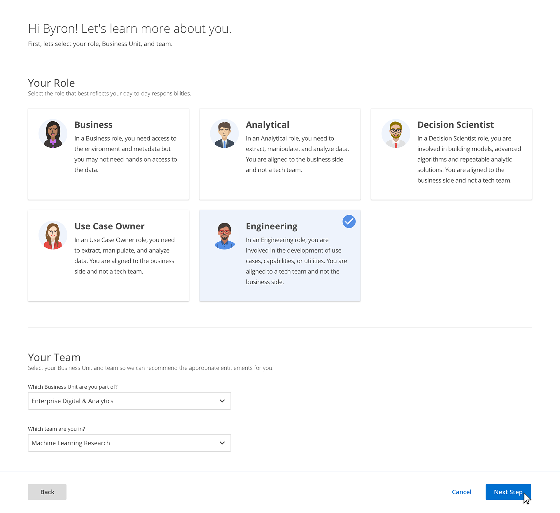
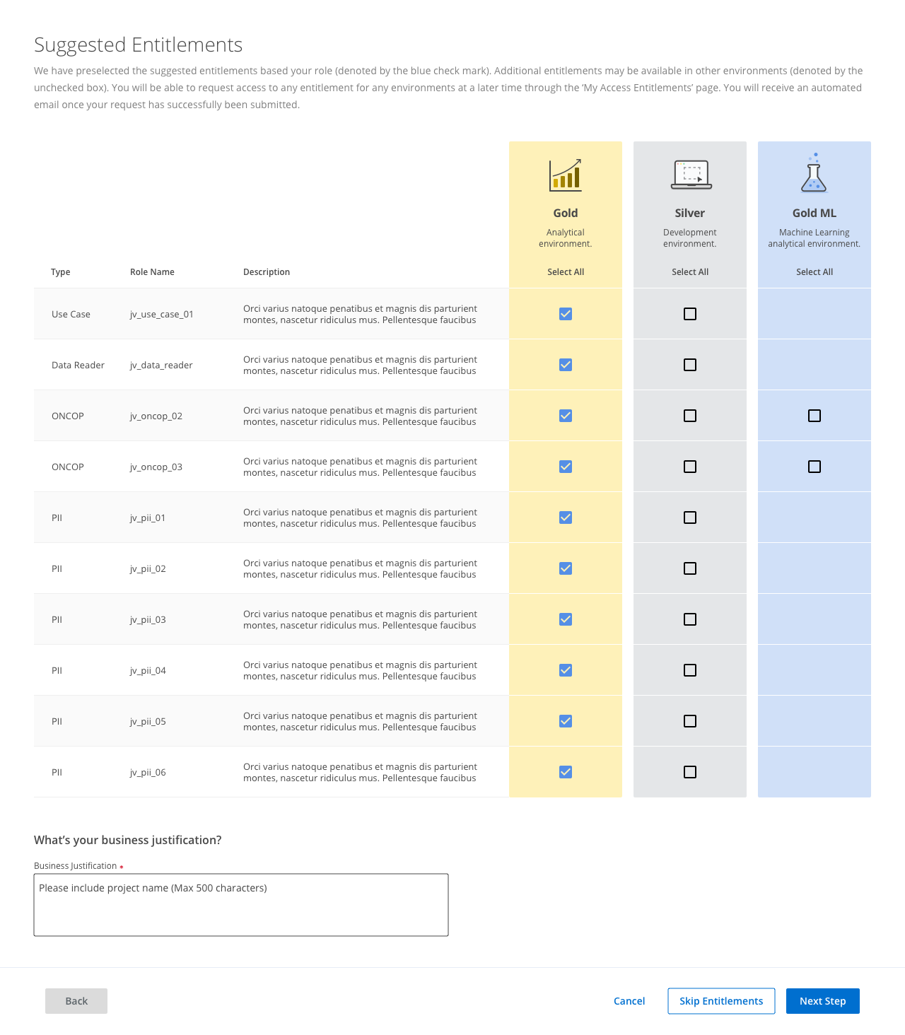
Suggest roles and access based on user type
How to navigate access dashboard
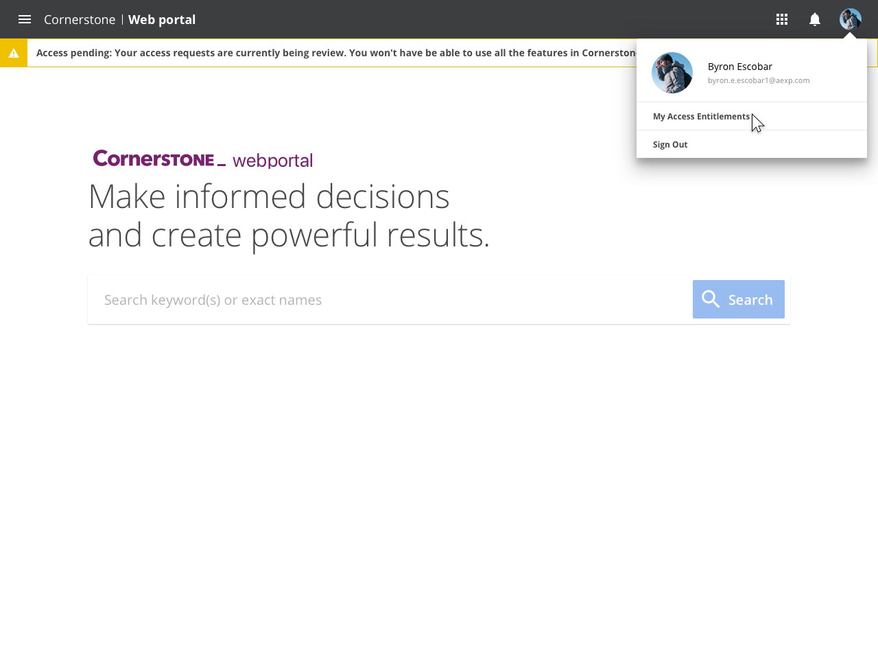
Access Dashboard
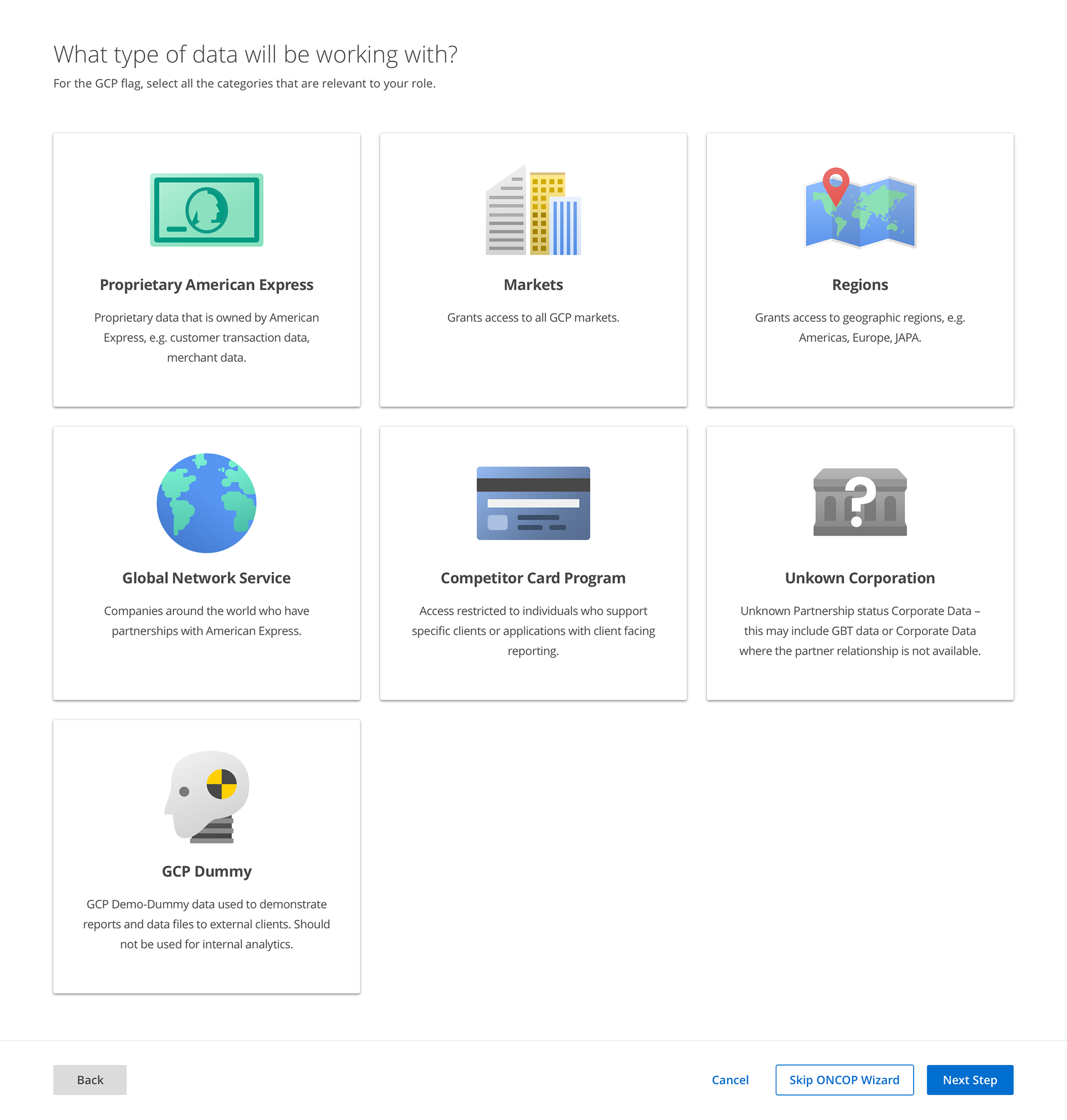
Getting access to special use cases in Cornerstone
Some tables require a lot of detail information to get an access. By clicking one or multiple tiles, users can get access to the table without frustration.
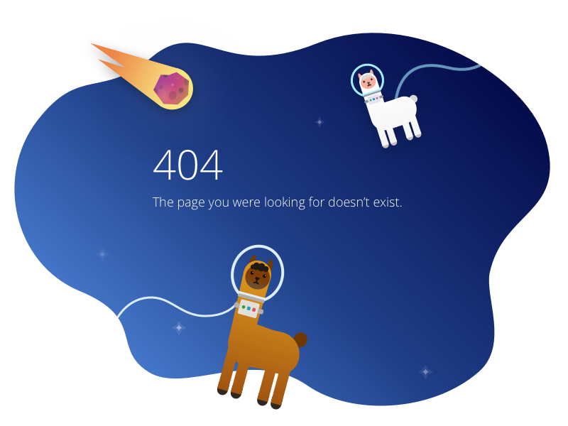
404 Error Message
This was a great place to express a designer's creativity. Based on our space design theme, I used a space llama, which one of our stakeholders raises at the farm.